Bitnova Framework Documentation
Empowering .NET developers with modern UI tools.
Bitnova Framework is a comprehensive .NET UI toolkit designed to streamline the development of robust, modern, and feature-rich Windows Forms applications using C# and VB.NET. It provides a rich set of pre-built components, controls, and design templates that enable developers to create stunning, responsive interfaces without starting from scratch. Whether you're building sleek dashboards, interactive forms, or data-driven visualizations, Bitnova simplifies complex workflows, reduces development time, and ensures high performance across various devices and resolutions. With its focus on creativity, productivity, and cost efficiency, Bitnova is ideal for developers who want to deliver professional-grade applications while minimizing repetitive coding tasks.
The framework emphasizes customizable, lightweight UI elements that integrate seamlessly into Visual Studio, offering advanced styling options, built-in themes, and optimized performance for real-world scenarios. It's particularly suited for applications requiring intuitive user experiences, such as business tools, dashboards, and enterprise software.
Introduction
Welcome to the Bitnova UI Framework documentation. Build modern, polished WinForms applications with our rich collection of animated, customizable controls — including buttons, cards, tooltips, scrollbars, textboxes, and more.
Installation
To begin using Bitnova UI, add the Bitnova.UI.dll to your project and integrate controls via the Visual Studio Toolbox.
1. Add Reference
- Open your WinForms project in Visual Studio 2019+.
- Right-click References (or Dependencies) in Solution Explorer → Add Reference.
- Click Browse → Select
Bitnova.UI.dll→ Add. - Build the project (Ctrl+Shift+B) to verify integration.
2. Add Controls to Toolbox
- Open a form in Design View.
- Right-click the Toolbox → Choose Items.
- Go to .NET Framework Components → Click Browse.
- Select
Bitnova.UI.dll→ Check allBitnova*controls → OK. - Optional: Right-click Toolbox → Add Tab → Name it
Bitnova UIfor organization.
3. Import Namespace (Recommended)
using Bitnova.UI;
using Bitnova.UI.Controls; // For advanced controls
4. Licensing
When you add a control or chart to your form(the first time), you will be prompted to enter your LICENSE ID and LICENSE KEY to activate Bitnova UI framework.
Enter the ones you were sent upon purchase and Activate.
Configuration
Customize controls using the Properties Window in the designer or programmatically in code. All controls feature categorized properties under Bitnova Appearance and Bitnova Behavior.
Example: Using BitnovaButton
// Designer: Drag from Toolbox → Set properties
// Code-behind:
var btn = new BitnovaButton
{
    Text = "Submit",
    Location = new Point(50, 50),
    BorderRadius = 16,
    BackColor = Color.FromArgb(0, 123, 255),
    ForeColor = Color.White,
    UseHoverEffect = true
};
btn.Click += (s, e) => MessageBox.Show("Submitted!");
this.Controls.Add(btn);
Pro Tip: Use DoubleBuffered = true on forms for flicker-free animations.
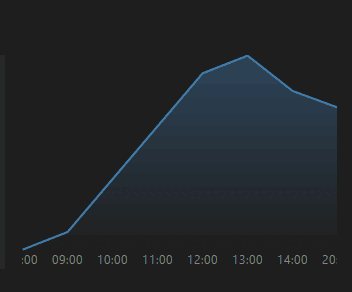
BitnovaAreaChart
The Bitnova Area Chart is a Windows Forms control designed to display an area chart with smooth animations and interactive hover effects. It supports data binding to any IEnumerable data source, customizable appearance, and real-time data updates with animation.
Key Features
Data Binding: Binds to an IEnumerable data source with customizable value and label properties.
Animation: Smoothly animates the chart on data updates when EnableAnimation is set.
Hover Interaction: Displays tooltips with data values when hovering over points if EnableHover is enabled.
Customizable Appearance: Configurable line color, fill color, line width, and hover point color.
Event Handling: Raises a DataRefreshed event when data is updated.
Properties
ChartBackColor: Background color of the chart (default: RGB(25, 25, 25)).
LineColor: Color of the area chart line (default: Color.CornflowerBlue).
LineWidth: Thickness of the chart line (default: 2f).
FillColor: Fill color for the area under the line (default: semi-transparent CornflowerBlue).
HoverPointColor: Color of the hover point (default: Color.Yellow).
EnableAnimation: Enables/disables animation on data updates (default: true).
EnableHover: Enables/disables hover tooltips (default: true).
AnimationSpeed: Animation frame interval in milliseconds (default: 20ms).
DataSource: The IEnumerable data source for the chart.
ValueMember: Property/column name for the chart values (required).
LabelMember: Property/column name for x-axis labels (required).
Events
DataRefreshed: Fired after data is bound or refreshed.
Usage
Add the BitnovaAreaChart control to a Windows Forms project.
Set the DataSource, ValueMember, and LabelMember properties to bind data.
Customize appearance using properties like LineColor, FillColor, and ChartBackColor.
Enable or disable EnableAnimation and EnableHover as needed.
Use the GetHoverTooltip method to programmatically retrieve the current hover tooltip text.
Demo Code
Below is a sample Windows Forms application demonstrating the BitnovaAreaChart control with a dynamic data source.
using System;
 using System.Collections.Generic;
 using System.Windows.Forms;
using Bitnova.UI.Controls;

namespace BitnovaAreaChartDemo { public partial class Form1 : Form { private List tempData;
 public Form1()
    {
        InitializeComponent();
        InitializeChart();
    }

    private void InitializeChart()
    {
        // Create sample data
        tempData = new List<TemperatureData>
        {
            new TemperatureData { Hour = "08:00", Temperature = 18.5 },
            new TemperatureData { Hour = "09:00", Temperature = 19.0 },
            new TemperatureData { Hour = "10:00", Temperature = 20.5 },
            new TemperatureData { Hour = "11:00", Temperature = 22.0 },
            new TemperatureData { Hour = "12:00", Temperature = 23.5 },
            new TemperatureData { Hour = "13:00", Temperature = 24.0 },
            new TemperatureData { Hour = "14:00", Temperature = 23.0 }
        };

        // Initialize BitnovaAreaChart
        var chart = new BitnovaAreaChart
        {
            Dock = DockStyle.Fill,
            DataSource = tempData,
            ValueMember = "Temperature",
            LabelMember = "Hour",
            LineColor = Color.SteelBlue,
            FillColor = Color.FromArgb(100, Color.SteelBlue),
            ChartBackColor = Color.FromArgb(30, 30, 30),
            EnableAnimation = true,
            EnableHover = true,
            AnimationSpeed = 30
        };

        // Subscribe to DataRefreshed event
        chart.DataRefreshed += (s, e) =>
        {
            Text = $"Chart Updated: {DateTime.Now.ToShortTimeString()}";
        };

        // Add chart to form
        Controls.Add(chart);

        // Simulate dynamic data update
        var timer = new Timer { Interval = 5000 };
        timer.Tick += (s, e) =>
        {
            tempData.Add(new TemperatureData
            {
                Hour = DateTime.Now.ToString("HH:mm"),
                Temperature = 18 + new Random().NextDouble() * 6
            });
            chart.DataSource = tempData; // Trigger refresh
        };
        timer.Start();
    }
}

public class TemperatureData
{
    public string Hour { get; set; }
    public double Temperature { get; set; }
}

static class Program
{
    [STAThread]
    static void Main()
    {
        Application.EnableVisualStyles();
        Application.SetCompatibleTextRenderingDefault(false);
        Application.Run(new Form1());
    }
}
BitnovaBarChart
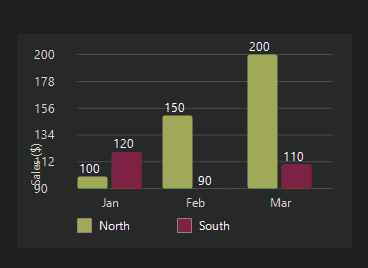
The Bitnova Bar Chart is a customizable Windows Forms control for displaying bar charts. It supports data binding, multiple series, real-time updates, and visual customization. The control is designed to be lightweight and easy to integrate into Windows Forms applications.
Key Features
Data Binding: Bind to any IEnumerable data source with customizable value, label, and series properties.
Real-Time Updates: Automatically refreshes data at a specified interval when RealTime is enabled.
Customizable Appearance: Supports custom colors, grid lines, legend, and axis labels.
Smooth Rendering: Uses anti-aliased graphics and rounded rectangles for bars.
Event Handling: Raises a DataBound event when data is refreshed.
Properties
RealTime: Enables/disables real-time data updates (default: true).
RefreshInterval: Sets the data refresh interval in milliseconds (default: 2000ms).
DataSource: The IEnumerable data source for the chart.
ValueMember: Property/column name for bar values (required).
LabelMember: Property/column name for x-axis labels (required).
SeriesMember: Optional property/column name for grouping data into series.
GridLineCount: Number of horizontal grid lines (default: 5).
ShowLegend: Shows/hides the legend for multiple series (default: true).
YAxisLabel: Label for the y-axis (default: "Values").
ChartBackColor: Background color of the chart area (default: RGB(25, 25, 25)).
Events
DataBound: Fired after data is bound or refreshed.
Usage
Add the BitnovaBarChart control to your Windows Forms project.
Set the DataSource, ValueMember, and LabelMember properties to bind data.
Optionally, set SeriesMember for multi-series charts.
Customize appearance using properties like ChartBackColor, GridLineCount, and ShowLegend.
Enable RealTime for automatic data refresh or manually call RefreshData().
Demo Code
Below is a sample Windows Forms application demonstrating the BitnovaBarChart control with a dynamic data source.
using System;
using System.Collections.Generic;
using System.Windows.Forms;
 using Bitnova.UI;

namespace BitnovaBarChartDemo { public partial class Form1 : Form { private List salesData;
 public Form1()
    {
        InitializeComponent();
        InitializeChart();
    }

    private void InitializeChart()
    {
        // Create sample data
        salesData = new List<SalesData>
        {
            new SalesData { Month = "Jan", Sales = 100, Region = "North" },
            new SalesData { Month = "Jan", Sales = 120, Region = "South" },
            new SalesData { Month = "Feb", Sales = 150, Region = "North" },
            new SalesData { Month = "Feb", Sales = 90, Region = "South" },
            new SalesData { Month = "Mar", Sales = 200, Region = "North" },
            new SalesData { Month = "Mar", Sales = 110, Region = "South" }
        };

        // Initialize BitnovaBarChart
        var chart = new BitnovaBarChart
        {
            Dock = DockStyle.Fill,
            DataSource = salesData,
            ValueMember = "Sales",
            LabelMember = "Month",
            SeriesMember = "Region",
            YAxisLabel = "Sales ($)",
            RealTime = false, // Set to true for real-time updates
            ChartBackColor = Color.FromArgb(40, 40, 40),
            ShowLegend = true
        };

        // Subscribe to DataBound event
        chart.DataBound += (s, e) =>
        {
            Text = $"Chart Updated: {DateTime.Now.ToShortTimeString()}";
        };

        // Add chart to form
        Controls.Add(chart);
    }
}

public class SalesData
{
    public string Month { get; set; }
    public double Sales { get; set; }
    public string Region { get; set; }
}

static class Program
{
    [STAThread]
    static void Main()
    {
        Application.EnableVisualStyles();
        Application.SetCompatibleTextRenderingDefault(false);
        Application.Run(new Form1());
    }
}
BitnovaBubbleChart
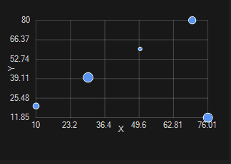
The Bitnova Bubble Chart is a Windows Forms control designed to display bubble charts, where data points are represented as circles with varying sizes (radii) on a 2D plane. It supports data binding to DataTable or IEnumerable<object> data sources, dynamic updates, hover effects, and customizable appearance with grid lines and labels.
Key Features
Data Binding: Binds to a DataTable or IEnumerable<object> with customizable XMember, YMember, and RadiusMember properties.
Dynamic Updates: Refreshes data at a configurable interval.
Hover Interaction: Highlights bubbles on hover with customizable colors and sizes.
Customizable Appearance: Configurable background colors, border styles, grid lines, and axis labels.
Event Handling: Raises DataBound on successful binding and BindingError on binding failures.
Properties
XAxisLabel: Label for the X-axis (default: "X").
YAxisLabel: Label for the Y-axis (default: "Y").
GridLineCount: Number of grid lines for axes (default: 5).
BackgroundColor: Fill color for bubbles (default: Color.FromArgb(66, 133, 244)).
HoverBackgroundColor: Fill color on hover (default: Color.FromArgb(66, 133, 244)).
BorderColor: Border color for bubbles (default: Color.Black).
BorderWidth: Border width for bubbles (default: 1).
HoverBorderWidth: Border width on hover (default: 2).
HoverRadiusIncrease: Additional radius on hover (default: 2).
Label: Series label (default: "Bubble Series").
DataSource: The DataTable or IEnumerable<object> data source.
XMember: Property/column name for X values (required).
YMember: Property/column name for Y values (required).
RadiusMember: Property/column name for radius values (required).
RefreshInterval: Data refresh interval in milliseconds (default: 0, disabled).
Events
DataBound: Fired after data is successfully bound (EventHandler).
BindingError: Fired when data binding encounters an error (EventHandler<Exception>).
Usage
Drag the BitnovaBubbleChart control onto a Windows Forms project via the Designer.
Set the DataSource to a DataTable or IEnumerable<object> with columns/properties for XMember, YMember, and RadiusMember.
Configure appearance using properties like BackgroundColor, BorderColor, and GridLineCount.
Enable dynamic updates by setting RefreshInterval to a positive value.
Subscribe to DataBound and BindingError events to monitor binding status.
Demo Code
Below is a sample Windows Forms application demonstrating the BitnovaBubbleChart control with a DataTable data source.
using System;
using System.Collections.Generic;
using System.Drawing;
using System.Windows.Forms;

namespace BitnovaBubbleDemo
{
    public partial class Form1 : Form
    {
        public Form1()
        {
            InitializeComponent();
            InitializeBubbleChart();
        }

        private void InitializeBubbleChart()
        {
            // ✅ 1. Create sample data
            var marketData = new List<MarketData>
            {
                new MarketData { Sales = 1000, Profit = 200, Volume = 50 },
                new MarketData { Sales = 1500, Profit = 300, Volume = 80 },
                new MarketData { Sales = 800, Profit = 150, Volume = 30 },
                new MarketData { Sales = 2000, Profit = 400, Volume = 100 },
                new MarketData { Sales = 1200, Profit = 250, Volume = 60 }
            };

            // ✅ 2. Set data source and mapping
            bitnovaBubbleChart1.DataSource = marketData;
            bitnovaBubbleChart1.XMember = "Sales";
            bitnovaBubbleChart1.YMember = "Profit";
            bitnovaBubbleChart1.RadiusMember = "Volume";

            // ✅ 3. Chart appearance
            bitnovaBubbleChart1.XAxisLabel = "Sales ($)";
            bitnovaBubbleChart1.YAxisLabel = "Profit ($)";
            bitnovaBubbleChart1.GridLineCount = 6;
            bitnovaBubbleChart1.Label = "Market Performance Overview";

            // ✅ 4. Bubble styling
            bitnovaBubbleChart1.BackgroundColor = Color.FromArgb(100, 181, 246);
            bitnovaBubbleChart1.HoverBackgroundColor = Color.FromArgb(255, 183, 77);
            bitnovaBubbleChart1.BorderColor = Color.DarkBlue;
            bitnovaBubbleChart1.BorderWidth = 2;
            bitnovaBubbleChart1.HoverBorderWidth = 3;
            bitnovaBubbleChart1.HoverRadiusIncrease = 4;

            // ✅ 5. Control styling
            bitnovaBubbleChart1.ForeColor = Color.White;
            bitnovaBubbleChart1.BackColor = Color.FromArgb(30, 30, 30);
            bitnovaBubbleChart1.Padding = new Padding(60, 40, 40, 60);
            bitnovaBubbleChart1.Font = new Font("Segoe UI", 9, FontStyle.Regular);

            // ✅ 6. Disable auto-refresh (no timer)
            bitnovaBubbleChart1.RefreshInterval = 0;

            // ✅ 7. Event handling
            bitnovaBubbleChart1.DataBound += (s, e) =>
            {
                Text = $"Chart Bound at {DateTime.Now:T}";
            };

            bitnovaBubbleChart1.BindingError += (s, ex) =>
            {
                MessageBox.Show($"Binding Error: {ex.Message}", "Error", MessageBoxButtons.OK, MessageBoxIcon.Error);
            };
        }
    }

    // ✅ 8. Data class
    public class MarketData
    {
        public double Sales { get; set; }
        public double Profit { get; set; }
        public double Volume { get; set; }
    }
}
BitnovaDoughnutChart
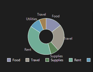
The Bitnova Doughnut Chart is a Windows Forms control designed to display multi-series doughnut charts with smooth animations and interactive hover effects. It supports data binding to any IEnumerable data source, customizable appearance, and real-time data updates with animation. The control can render multiple concentric rings, each representing a series, with slices corresponding to data categories.
Key Features
Data Binding: Binds to an IEnumerable data source with customizable value, label, and optional series properties.
Multi-Series Support: Displays multiple concentric doughnut rings for grouped data when SeriesMember is specified.
Animation: Smoothly animates chart updates when EnableAnimations is set.
Hover Interaction: Highlights slices and provides tooltips on hover.
Customizable Appearance: Configurable background color, legend visibility, ring spacing, and color palettes.
Real-Time Updates: Automatically refreshes data at a specified interval when RealTime is enabled.
Event Handling: Raises a DataRefreshed event when data is updated.
Properties
ChartBackColor: Background color of the chart (default: RGB(25, 25, 25)).
ShowLegend: Shows/hides the legend for series (default: true).
LegendSpacing: Horizontal spacing between legend items (default: 12 pixels).
InnerRadiusPadding: Spacing between concentric rings (default: 8 pixels).
EnableAnimations: Enables/disables animation on data updates (default: true).
RealTime: Enables/disables real-time data updates (default: true).
RefreshInterval: Data refresh interval in milliseconds when RealTime is enabled (default: 2000ms).
DataSource: The IEnumerable data source for the chart.
ValueMember: Property/column name for the chart values (required).
LabelMember: Property/column name for category labels (required).
SeriesMember: Optional property/column name for grouping data into series.
Events
DataRefreshed: Fired after data is bound or refreshed.
Usage
Add the BitnovaDoughnutChart control to a Windows Forms project.
Set the DataSource, ValueMember, and LabelMember properties to bind data.
Optionally, set SeriesMember to group data into multiple concentric rings.
Customize appearance using properties like ChartBackColor, ShowLegend, and InnerRadiusPadding.
Enable or disable EnableAnimations and RealTime as needed.
Use the GetHoverTooltip method to programmatically retrieve the current hover tooltip text.
Alternatively, use the SetSeries method to programmatically set data with custom labels, values, colors, and series names.
Demo Code
Below is a sample Windows Forms application demonstrating the BitnovaDoughnutChart control with a dynamic data source, showcasing both single-series and multi-series configurations.
using System;
using System.Collections.Generic;
 using System.Drawing;
using System.Windows.Forms;
using Bitnova.UI.Controls;

namespace BitnovaDoughnutChartDemo { public partial class Form1 : Form { private List expenseData;
  public Form1()
    {
        InitializeComponent();
        InitializeChart();
    }

    private void InitializeChart()
    {
        // Create sample data for multi-series doughnut chart
        expenseData = new List<ExpenseData>
        {
            new ExpenseData { Category = "Food", Amount = 300, Department = "Marketing" },
            new ExpenseData { Category = "Food", Amount = 200, Department = "Engineering" },
            new ExpenseData { Category = "Travel", Amount = 500, Department = "Marketing" },
            new ExpenseData { Category = "Travel", Amount = 400, Department = "Engineering" },
            new ExpenseData { Category = "Supplies", Amount = 150, Department = "Marketing" },
            new ExpenseData { Category = "Supplies", Amount = 250, Department = "Engineering" }
        };

        // Initialize BitnovaDoughnutChart
        var chart = new BitnovaDoughnutChart
        {
            Dock = DockStyle.Fill,
            DataSource = expenseData,
            ValueMember = "Amount",
            LabelMember = "Category",
            SeriesMember = "Department",
            ChartBackColor = Color.FromArgb(30, 30, 30),
            ShowLegend = true,
            InnerRadiusPadding = 10,
            EnableAnimations = true,
            RealTime = true,
            RefreshInterval = 5000
        };

        // Subscribe to DataRefreshed event
        chart.DataRefreshed += (s, e) =>
        {
            Text = $"Chart Updated: {DateTime.Now.ToShortTimeString()}";
        };

        // Add chart to form
        Controls.Add(chart);

        // Simulate dynamic data update
        var timer = new Timer { Interval = 5000 };
        timer.Tick += (s, e) =>
        {
            expenseData.Add(new ExpenseData
            {
                Category = new[] { "Food", "Travel", "Supplies" }[new Random().Next(0, 3)],
                Amount = 100 + new Random().NextDouble() * 400,
                Department = new[] { "Marketing", "Engineering" }[new Random().Next(0, 2)]
            });
            chart.DataSource = expenseData; // Trigger refresh
        };
        timer.Start();
    }
}

public class ExpenseData
{
    public string Category { get; set; }
    public double Amount { get; set; }
    public string Department { get; set; }
}

static class Program
{
    [STAThread]
    static void Main()
    {
        Application.EnableVisualStyles();
        Application.SetCompatibleTextRenderingDefault(false);
        Application.Run(new Form1());
    }
}
BitnovaLineChart
The Bitnova Line Chart is a custom Windows Forms control within the Bitnova.UI.Controls namespace that renders a line chart with multiple data series, customizable labels, and colors. It supports anti-aliased rendering and provides a clean, modern visualization for numerical data.
Overview
The BitnovaLineChart control inherits from the System.Windows.Forms.Control class and is designed to display one or more line series based on provided data points. It includes x-axis labels, y-axis grid lines, and value labels at data points, with customizable colors and styling for a professional appearance.
Key Features
- Multiple Series: Supports multiple data series with distinct colors.
- Customizable Data: Configurable x-axis labels and y-axis values through the SetData method or Points property.
- Smooth Rendering: Utilizes anti-aliasing for smooth lines and text.
- Value Labels: Displays numerical values above data points.
- Grid Lines: Includes y-axis grid lines for reference.
- Designer Support: Properties are accessible in the Windows Forms Designer.
- Double Buffering: Enabled to reduce flickering during rendering.
Properties
| Property | Type | Category | Description |
|---|---|---|---|
| Points | List<(string Label, float Value)> | None (Browsable) | Gets or sets a list of tuples containing labels and values for a single series. Setting this property triggers a redraw. |
| LineColor | Color | None (Browsable) | Gets or sets the color for lines when using the Points property. Default is Color.Blue. Setting this property triggers a redraw. |
Methods
| Method | Parameters | Description |
|---|---|---|
| SetData | List<string> xLabels, List<List<float>> ySeries, List<Color> colors | Sets the x-axis labels, y-axis series data, and corresponding colors for multiple series. Triggers a redraw. |
|
using System;
using System.Collections.Generic;
using System.Drawing;
using System.Windows.Forms;
using Bitnova.UI.Controls;
namespace BitnovaLineChartDemo
{
public partial class Form1 : Form
{
private List<PerformanceData> performanceData;
public Form1()
{
InitializeComponent();
Load += Form1_Load; // Ensure chart is initialized after form is ready
}
private void Form1_Load(object sender, EventArgs e)
{
// ✅ 1. Create sample data
performanceData = new List<PerformanceData>
{
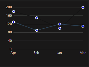
new PerformanceData { Month = "Jan", Value = 100, Team = "Team A" },
new PerformanceData { Month = "Jan", Value = 120, Team = "Team B" },
new PerformanceData { Month = "Feb", Value = 150, Team = "Team A" },
new PerformanceData { Month = "Feb", Value = 90, Team = "Team B" },
new PerformanceData { Month = "Mar", Value = 200, Team = "Team A" },
new PerformanceData { Month = "Mar", Value = 110, Team = "Team B" },
new PerformanceData { Month = "Apr", Value = 180, Team = "Team A" },
new PerformanceData { Month = "Apr", Value = 130, Team = "Team B" }
};
// ✅ 2. Bind data to the chart
bitnovaLineChart1.DataSource = performanceData;
bitnovaLineChart1.LabelMember = "Month";
bitnovaLineChart1.ValueMember = "Value";
bitnovaLineChart1.SeriesMember = "Team";
// ✅ 3. Customize chart appearance
bitnovaLineChart1.InterpolationMode = BitnovaLineChart.InterpolationModeOption.Linear;
bitnovaLineChart1.ShowLines = true;
bitnovaLineChart1.ShowPoints = true;
bitnovaLineChart1.PointRadius = 5;
bitnovaLineChart1.PointBorderWidth = 2;
bitnovaLineChart1.PointBorderColor = Color.White;
bitnovaLineChart1.PointBackgroundColor = Color.SteelBlue;
bitnovaLineChart1.PointHoverBackgroundColor = Color.Orange;
bitnovaLineChart1.PointHoverRadius = 7;
bitnovaLineChart1.EnableHover = true;
bitnovaLineChart1.Fill = BitnovaLineChart.FillMode.Start;
bitnovaLineChart1.FillColor = Color.FromArgb(80, Color.SteelBlue);
bitnovaLineChart1.BackColor = Color.FromArgb(30, 30, 30);
}
}
public class PerformanceData
{
public string Month { get; set; }
public double Value { get; set; }
public string Team { get; set; }
}
}
BitnovaPieChart
The BitnovaPieChart is a custom Windows Forms control within the Bitnova.UI.Controls namespace that renders a pie or doughnut chart with customizable segments. Each segment is defined by a label, value, and color, and the chart supports an optional inner radius for a doughnut effect, with percentage labels displayed on each segment.
The Bitnova Pie Chart control inherits from the System.Windows.Forms.Control class and is designed to visualize proportional data as a pie or doughnut chart. It supports anti-aliased rendering, percentage labels for each segment, and a configurable inner radius to create a doughnut appearance when desired.
Key Features
- Customizable Segments: Define segments with labels, values, and colors using the Segments property.
- Pie or Doughnut Style: Supports pie charts (default) or doughnut charts with a configurable InnerRadius.
- Percentage Labels: Displays labels with percentage values centered on each segment.
- Smooth Rendering: Utilizes anti-aliasing for high-quality visuals.
- Double Buffering: Enabled to reduce flickering during rendering.
- Designer Support: Properties are accessible in the Windows Forms Designer.
Properties
| Property | Type | Category | Description |
|---|---|---|---|
| Segments | List<(string Label, float Value, Color Color)> | Bitnova | Gets or sets the list of chart segments, each defined by a label, value, and color. Setting this property triggers a redraw. |
| InnerRadius | int | Bitnova | Gets or sets the radius of the inner circle for a doughnut effect (0 for a pie chart). Default is 0. Setting this property triggers a redraw. |
| Property | Description |
|---|---|
DataSource |
Accepts a collection of data objects (e.g., List<T>). |
ValueMember |
Specifies the property used for numeric values. |
LabelMember |
Specifies the property used for labels/categories. |
using System;
using System.Collections.Generic;
using System.Drawing;
using System.Windows.Forms;
using Bitnova.UI.Controls;
namespace BitnovaPieChartDemo
{
public partial class Form1 : Form
{
private List<BudgetData> budgetData;
public Form1()
{
InitializeComponent();
Load += Form1_Load; // Ensure chart is bound after form is loaded
}
private void Form1_Load(object sender, EventArgs e)
{
// ✅ 1. Prepare data
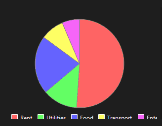
budgetData = new List<BudgetData>
{
new BudgetData { Category = "Rent", Amount = 1200 },
new BudgetData { Category = "Utilities", Amount = 300 },
new BudgetData { Category = "Food", Amount = 500 },
new BudgetData { Category = "Transport", Amount = 200 },
new BudgetData { Category = "Entertainment", Amount = 150 }
};
// ✅ 2. Bind data to the chart
bitnovaPieChart1.ValueMember = "Amount";
bitnovaPieChart1.LabelMember = "Category";
bitnovaPieChart1.DataSource = budgetData;
// ✅ 3. Customize chart appearance
bitnovaPieChart1.BackgroundColors = new List<Color>
{
Color.FromArgb(255, 100, 100),
Color.FromArgb(100, 255, 100),
Color.FromArgb(100, 100, 255),
Color.FromArgb(255, 255, 100),
Color.FromArgb(255, 100, 255)
};
bitnovaPieChart1.ChartBackColor = Color.FromArgb(30, 30, 30);
bitnovaPieChart1.BorderColor = Color.Gray;
bitnovaPieChart1.BorderWidth = 1.5f;
bitnovaPieChart1.EnableHover = true;
bitnovaPieChart1.EnableAnimation = true;
}
}
public class BudgetData
{
public string Category { get; set; }
public double Amount { get; set; }
}
}
BitnovaPolarChart
The Bitnova Polar Chart is a Windows Forms control designed to display polar area charts, where data values are represented by sectors of a circular chart. It supports data binding to IEnumerable or DataTable sources, customizable colors, and real-time updates. The chart features a gradient-filled polygon with labels and an optional legend.
Key Features
Data Binding: Binds to IEnumerable or DataTable data sources with customizable value and label properties.
Customizable Appearance: Supports custom colors for each sector, background color, and legend visibility.
Real-Time Updates: Automatically refreshes data at a specified interval when DataSource is set.
Event Handling: Raises an OnDataRefreshed event when data is bound or refreshed.
Visual Design: Uses smooth anti-aliased rendering and gradient fills for a polished look.
Properties
Values: List of numerical values for the chart sectors (default: empty list).
Labels: List of labels for each sector (default: empty list).
SeriesColors: List of colors for each sector (default: empty list, auto-generated if needed).
DataSource: The IEnumerable or DataTable data source for the chart.
ValueMember: Property/column name for sector values (required for data binding).
LabelMember: Property/column name for sector labels (required for data binding).
RefreshInterval: Data refresh interval in milliseconds (default: 2000ms).
ShowLegend: Shows/hides the legend (default: true).
Events
OnDataRefreshed: Fired after data is successfully bound or refreshed.
Usage
Add the BitnovaPolarChart control to a Windows Forms project.
Set the DataSource, ValueMember, and LabelMember properties for data binding, or manually set Values, Labels, and SeriesColors.
Customize appearance using SeriesColors, ShowLegend, and BackColor.
Enable real-time updates by setting DataSource and ensuring RefreshInterval is positive.
Handle the OnDataRefreshed event to respond to data updates.
Demo Code
Below is a sample Windows Forms application demonstrating the BitnovaPolarChart control with a dynamic data source.
using System;
using System.Collections.Generic;
using System.Drawing;
using System.Windows.Forms;
using Bitnova.UI.Controls;
namespace BitnovaPolarChartDemo { public partial class Form1 : Form { private List salesData;
public Form1()
{
InitializeComponent();
InitializeChart();
}
private void InitializeChart()
{
// Create sample data
salesData = new List<SalesData>
{
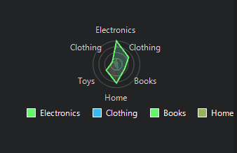
new SalesData { Category = "Electronics", Revenue = 5000 },
new SalesData { Category = "Clothing", Revenue = 3000 },
new SalesData { Category = "Books", Revenue = 2000 },
new SalesData { Category = "Home", Revenue = 4000 },
new SalesData { Category = "Toys", Revenue = 2500 }
};
// Initialize BitnovaPolarChart
var chart = new BitnovaPolarChart
{
Dock = DockStyle.Fill,
DataSource = salesData,
ValueMember = "Revenue",
LabelMember = "Category",
BackColor = Color.FromArgb(35, 35, 35),
ShowLegend = true,
RefreshInterval = 5000
};
// Set custom colors
chart.SeriesColors = new List<Color>
{
Color.FromArgb(255, 100, 100),
Color.FromArgb(100, 255, 100),
Color.FromArgb(100, 100, 255),
Color.FromArgb(255, 255, 100),
Color.FromArgb(255, 100, 255)
};
// Subscribe to OnDataRefreshed event
chart.OnDataRefreshed += (s, e) =>
{
Text = $"Chart Updated: {DateTime.Now.ToShortTimeString()}";
};
// Add chart to form
Controls.Add(chart);
// Simulate dynamic data update
var timer = new Timer { Interval = 5000 };
timer.Tick += (s, e) =>
{
salesData.Add(new SalesData
{
Category = new[] { "Electronics", "Clothing", "Books", "Home", "Toys" }[new Random().Next(0, 5)],
Revenue = 1000 + new Random().NextDouble() * 4000
});
chart.DataSource = salesData; // Trigger refresh
};
timer.Start();
}
}
public class SalesData
{
public string Category { get; set; }
public double Revenue { get; set; }
}
static class Program
{
[STAThread]
static void Main()
{
Application.EnableVisualStyles();
Application.SetCompatibleTextRenderingDefault(false);
Application.Run(new Form1());
}
}BitnovaRadarChart
The Bitnova Radar Chart is a Windows Forms control designed to display multi-series radar (spider) charts, where data points are plotted on axes radiating from a central point, forming a polygonal shape for each series. It supports data binding to DataTable or IEnumerable<object> data sources, dynamic updates, hover tooltips, and customizable appearance with grid lines, fill options, and legends.
Key Features
Data Binding: Binds to a DataTable or IEnumerable<object> with customizable LabelMember, ValueMember, and SeriesMember properties.
Multi-Series Support: Displays multiple series with distinct colors and labels, ideal for comparing categories across teams or groups.
Dynamic Updates: Supports real-time data refresh with a configurable interval via a timer.
Hover Interaction: Highlights points and displays tooltips on hover.
Customizable Appearance: Configurable title, scale maximum, grid lines, fill, border, and point styles.
Event Handling: Raises DataBound (on successful binding) and BindingError (on binding failures) events.
Properties
Title: Chart title (default: "Radar Chart").
ScaleMax: Maximum value for the scale (default: 100).
GridLineCount: Number of concentric grid lines (default: 5).
ShowLegend: Displays a legend for series (default: true).
Fill: Fills the area under each series polygon (default: false).
BorderColor: Color of the series border lines (default: Color.Blue).
BorderWidth: Width of the series border lines (default: 2).
PointRadius: Radius of data points (default: 5).
PointColor: Color of data points (default: Color.White).
PointBorderWidth: Border width of data points (default: 1).
PointBorderColor: Border color of data points (default: Color.Black).
PointRotation: Rotation angle of points (default: 0).
PointHoverRadius: Radius of points on hover (default: 7).
PointHoverColor: Color of points on hover (default: Color.Orange).
DataSource: The DataTable or IEnumerable<object> data source.
LabelMember: Property/column name for axis labels (required).
ValueMember: Property/column name for data values (required).
SeriesMember: Property/column name for grouping data into series (optional).
RefreshInterval: Data refresh interval in milliseconds (default: 0, disabled).
Events
DataBound: Fired after data is successfully bound (EventHandler).
BindingError: Fired when data binding encounters an error (EventHandler<Exception>).
Usage
Drag the BitnovaRadarChart control onto a Windows Forms project via the Designer.
Set the DataSource to a DataTable or IEnumerable<object> with columns/properties for LabelMember, ValueMember, and SeriesMember.
Configure appearance using properties like Title, ScaleMax, GridLineCount, ShowLegend, Fill, BorderColor, and point styles.
Enable dynamic updates by setting RefreshInterval to a positive value.
Subscribe to DataBound and BindingError events to monitor binding status.
Use a Timer to simulate dynamic data updates by modifying the DataTable and reassigning the DataSource.
Demo Code
Below is a sample Windows Forms application demonstrating the BitnovaRadarChart control with a DataTable data source and dynamic updates.
using System;
using System.Collections.Generic;
using System.Data;
using System.Drawing;
using System.Windows.Forms;
using Bitnova.UI.Controls;
namespace BitnovaRadarChartDemo { public partial class Form1 : Form { private DataTable performanceTable; private Random rnd = new Random(); private Timer updateTimer;
public Form1()
{
InitializeComponent();
InitializeChart();
}
private void InitializeChart()
{
// Create a DataTable (this avoids the delegate creation path in BindData)
performanceTable = new DataTable();
performanceTable.Columns.Add("Metric", typeof(string));
performanceTable.Columns.Add("Value", typeof(double));
performanceTable.Columns.Add("Team", typeof(string));
// Add initial rows
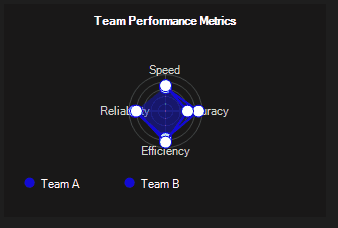
performanceTable.Rows.Add("Speed", 80d, "Team A");
performanceTable.Rows.Add("Speed", 70d, "Team B");
performanceTable.Rows.Add("Accuracy", 90d, "Team A");
performanceTable.Rows.Add("Accuracy", 60d, "Team B");
performanceTable.Rows.Add("Efficiency", 75d, "Team A");
performanceTable.Rows.Add("Efficiency", 85d, "Team B");
performanceTable.Rows.Add("Reliability", 85d, "Team A");
performanceTable.Rows.Add("Reliability", 80d, "Team B");
// Configure the existing designer-placed control (bitnovaRadarChart1)
bitnovaRadarChart1.DataSource = performanceTable;
bitnovaRadarChart1.LabelMember = "Metric";
bitnovaRadarChart1.ValueMember = "Value";
bitnovaRadarChart1.SeriesMember = "Team";
bitnovaRadarChart1.Title = "Team Performance Metrics";
bitnovaRadarChart1.ScaleMax = 100;
bitnovaRadarChart1.GridLineCount = 5;
bitnovaRadarChart1.ShowLegend = true;
bitnovaRadarChart1.Fill = true;
bitnovaRadarChart1.BorderColor = Color.SteelBlue;
bitnovaRadarChart1.PointColor = Color.White;
bitnovaRadarChart1.PointHoverColor = Color.Yellow;
bitnovaRadarChart1.PointRadius = 6;
bitnovaRadarChart1.PointHoverRadius = 8;
bitnovaRadarChart1.RefreshInterval = 5000;
// Subscribe to DataBound (EventHandler) and BindingError (EventHandler<Exception>)
bitnovaRadarChart1.DataBound += BitnovaRadarChart1_DataBound;
bitnovaRadarChart1.BindingError += BitnovaRadarChart1_BindingError;
// Start timer to simulate dynamic updates
updateTimer = new Timer { Interval = 5000 };
updateTimer.Tick += UpdateTimer_Tick;
updateTimer.Start();
}
private void BitnovaRadarChart1_DataBound(object sender, EventArgs e)
{
// Update form title on successful bind
Text = $"Chart Updated: {DateTime.Now:HH:mm:ss}";
}
private void BitnovaRadarChart1_BindingError(object sender, Exception ex)
{
// BindingError is EventHandler<Exception> in your control
MessageBox.Show($"Data binding error: {ex.Message}", "Binding Error",
MessageBoxButtons.OK, MessageBoxIcon.Error);
}
private void UpdateTimer_Tick(object sender, EventArgs e)
{
try
{
// Add a new random row (rotate among metrics and teams)
string[] metrics = { "Speed", "Accuracy", "Efficiency", "Reliability" };
string[] teams = { "Team A", "Team B" };
var metric = metrics[rnd.Next(metrics.Length)];
var team = teams[rnd.Next(teams.Length)];
var value = 50 + rnd.NextDouble() * 50;
// Add row to DataTable
performanceTable.Rows.Add(metric, value, team);
// Optionally keep table size manageable (remove oldest rows)
if (performanceTable.Rows.Count > 40)
performanceTable.Rows.RemoveAt(0);
// Rebind the DataTable to trigger a refresh
bitnovaRadarChart1.DataSource = null;
bitnovaRadarChart1.DataSource = performanceTable;
}
catch (Exception ex)
{
// If anything unexpected happens, surface it
MessageBox.Show($"Update error: {ex.Message}", "Error",
MessageBoxButtons.OK, MessageBoxIcon.Warning);
}
}
private void InitializeComponent()
{
this.bitnovaRadarChart1 = new Bitnova.UI.Controls.BitnovaRadarChart();
this.SuspendLayout();
//
// bitnovaRadarChart1
//
this.bitnovaRadarChart1.Dock = System.Windows.Forms.DockStyle.Fill;
this.bitnovaRadarChart1.Location = new System.Drawing.Point(0, 0);
this.bitnovaRadarChart1.Name = "bitnovaRadarChart1";
this.bitnovaRadarChart1.Size = new System.Drawing.Size(800, 600);
this.bitnovaRadarChart1.TabIndex = 0;
//
// Form1
//
this.AutoScaleDimensions = new System.Drawing.SizeF(6F, 13F);
this.AutoScaleMode = System.Windows.Forms.AutoScaleMode.Font;
this.ClientSize = new System.Drawing.Size(800, 600);
this.Controls.Add(this.bitnovaRadarChart1);
this.FormBorderStyle = System.Windows.Forms.FormBorderStyle.FixedSingle;
this.MaximizeBox = false;
this.Name = "Form1";
this.Text = "Bitnova Radar Chart Demo";
this.ResumeLayout(false);
}
private BitnovaRadarChart bitnovaRadarChart1;
}Bitnova ScrollBars
BitnovaVScrollBar & BitnovaHScrollBar – beautiful, animated, bindable, customizable scrollbars with smooth hover/click effects, rounded corners, auto-hide, context menu, and full integration with ScrollableControl and DataGridView.
Perfect for modern WinForms apps: dashboards, file explorers, chat apps, or replacing default scrollbars.
Features
| Feature | Description |
|---|---|
| Smooth animations | Inertia-like scrolling with Timer |
| Auto-binding | Syncs with Panel, DataGridView, etc. |
| Thumb styles | Inset (classic), Proportional (full-width) |
| Hover & Press effects | Lighten/darken thumb |
| Auto-shrink on blur | Slim when inactive |
| Right-click menu | "Scroll to Top/Left", "Scroll to Bottom/Right" |
| Keyboard support | Arrows, Page Up/Down, Home/End |
| Rounded corners + border | Fully customizable |
| No flicker | DoubleBuffered |
Properties (Both V & H)
| Property | Default | Description |
|---|---|---|
| Minimum / Maximum | 0 / 100 | Scroll range |
| Value | 0 | Current position |
| SmallChange / LargeChange | 1 / 10 | Step sizes |
| BindingContainer | null | Control to sync with |
| AllowScrollingAnimations | true | Smooth scroll |
| AllowScrollKeysDetection | true | Arrow keys |
| AllowHomeEndKeysDetection | true | Home/End |
| AllowShrinkingOnFocusLost | false | Auto-hide |
| ShrinkSizeLimit | 5 | Min width/height when shrunk |
| ThumbStyle | Inset | Inset or Proportional |
| ThumbColor | DarkGray | Thumb fill |
| ThumbMargin | 2 | Space around thumb |
| ThumbLength | 40 | Min thumb size |
| BorderRadius | 0 | Rounded corners |
| BorderThickness | 1 | Border width |
| BorderColor | Gray | Border color |
using System;
using System.Drawing;
using System.Windows.Forms;
using Bitnova.UI;

namespace BitnovaScrollBarDemo
{
    public partial class Form1 : Form
    {
        private Panel scrollPanel;
        private BitnovaVScrollBar vScroll;
        private BitnovaHScrollBar hScroll;

        public Form1()
        {
            InitializeComponent();
            SetupScrollArea();
        }

        private void SetupScrollArea()
        {
            this.Text = "Bitnova ScrollBars – Smooth & Modern";
            this.BackColor = Color.FromArgb(245, 247, 250);
            this.Size = new Size(800, 600);

            // Content Panel
            scrollPanel = new Panel
            {
                Location = new Point(20, 20),
                Size = new Size(740, 520),
                BackColor = Color.White,
                AutoScroll = true,
                BorderStyle = BorderStyle.None
            };

            // Large content
            for (int i = 0; i < 50; i++)
            {
                var lbl = new Label
                {
                    Text = $"Item {i + 1:000} – Lorem ipsum dolor sit amet",
                    Location = new Point(20 + (i % 5) * 140, 20 + (i / 5) * 60),
                    AutoSize = true,
                    Font = new Font("Segoe UI", 10F)
                };
                scrollPanel.Controls.Add(lbl);
            }
            scrollPanel.Size = new Size(800, 3000); // Force scroll

            // Custom Scrollbars
            vScroll = new BitnovaVScrollBar
            {
                Dock = DockStyle.Right,
                Width = 18,
                ThumbColor = Color.FromArgb(100, 100, 100),
                BorderRadius = 9,
                ThumbStyle = ThumbStyle.Proportional,
                AllowScrollingAnimations = true,
                AllowShrinkingOnFocusLost = true,
                ShrinkSizeLimit = 6
            };

            hScroll = new BitnovaHScrollBar
            {
                Dock = DockStyle.Bottom,
                Height = 18,
                ThumbColor = Color.FromArgb(100, 100, 100),
                BorderRadius = 9,
                ThumbStyle = ThumbStyle.Proportional,
                AllowScrollingAnimations = true,
                AllowShrinkingOnFocusLost = true,
                ShrinkSizeLimit = 6
            };

            // Bind
            vScroll.BindTo(scrollPanel);
            hScroll.BindTo(scrollPanel);

            // Add to container
            var container = new Panel { Dock = DockStyle.Fill };
            container.Controls.Add(scrollPanel);
            container.Controls.Add(vScroll);
            container.Controls.Add(hScroll);

            this.Controls.Add(container);
        }
    }
}
BitnovaButton
A modern, customizable button control with rounded corners, hover/press states, and smooth anti-aliased rendering.
Features
- Rounded corners with adjustable BorderRadius
- Custom border with BorderSize and BorderColor
- Hover & Press color effects (visual feedback)
- Smooth anti-aliasing for professional look
- Inherits from Button – full compatibility with standard button events
- Designer-friendly properties under "Bitnova Appearance" category
| Property | Type | Description |
|---|---|---|
BorderSize | int | Thickness of the border (0 = no border) |
BorderRadius | int | Corner radius in pixels (0 = sharp corners) |
BorderColor | Color | Color of the border |
BackgroundColor | Color | Maps to BackColor |
TextColor | Color | Maps to ForeColor |
using System;
using System.Drawing;
using System.Windows.Forms;
using Bitnova.UI.WinForms.Controls;

namespace BitnovaButtonDemo
{
    public partial class Form1 : Form
    {
        public Form1()
        {
            InitializeComponent();
            SetupBitnovaButtons();
        }

        private void SetupBitnovaButtons()
        {
            // Button 1: Modern Blue
            var btnModern = new BitnovaButton
            {
                Text = "Click Me",
                Location = new Point(50, 50),
                Size = new Size(180, 50),
                BorderRadius = 25,
                BorderSize = 2,
                BorderColor = Color.FromArgb(0, 120, 215),
                BackColor = Color.FromArgb(0, 120, 215),
                ForeColor = Color.White,
                Font = new Font("Segoe UI", 10F, FontStyle.Bold)
            };
            btnModern.Click += (s, e) => MessageBox.Show("Modern button clicked!");

            // Button 2: Success Style (Green)
            var btnSuccess = new BitnovaButton
            {
                Text = "Success",
                Location = new Point(50, 120),
                Size = new Size(180, 50),
                BorderRadius = 15,
                BorderSize = 0,
                BackColor = Color.FromArgb(40, 167, 69),
                ForeColor = Color.White
            };
            btnSuccess.Click += (s, e) => MessageBox.Show("Success action!");

            // Button 3: Warning with Hover Effect
            var btnWarning = new BitnovaButton
            {
                Text = "Warning",
                Location = new Point(50, 190),
                Size = new Size(180, 50),
                BorderRadius = 30,
                BorderSize = 3,
                BorderColor = Color.Orange,
                BackColor = Color.FromArgb(255, 193, 7),
                ForeColor = Color.Black
            };

            // Add to form
            this.Controls.Add(btnModern);
            this.Controls.Add(btnSuccess);
            this.Controls.Add(btnWarning);

            // Optional: Add a title
            var lblTitle = new Label
            {
                Text = "BitnovaButton Demo",
                Location = new Point(50, 20),
                AutoSize = true,
                Font = new Font("Segoe UI", 14F, FontStyle.Bold),
                ForeColor = Color.FromArgb(40, 40, 40)
            };
            this.Controls.Add(lblTitle);
        }
    }
}
BitnovaCard
A sleek, customizable card UI component with icon, title, detail, and progress bar — ideal for dashboards and modern WinForms applications.
Features
- Rounded corners with smooth anti-aliasing
- Soft shadow effect for depth
- Customizable card color and progress bar
- Icon support (left-aligned)
- Two-line text layout: bold title + large detail
- Transparent background – blends with parent
- Double-buffered for flicker-free rendering
| Property | Type | Default | Description |
|---|---|---|---|
MainText | string | "Title" | Top-left bold text (e.g., "Projects") |
DetailText | string | "Detail" | Larger detail text below (e.g., "1,234") |
Icon | Image | null | 32×32 icon displayed on the left |
CardColor | Color | DodgerBlue | Background fill of the card |
ProgressColor | Color | White | Color of the progress bar |
ProgressValue | int | 70 | Value from 0 to 100 |
using System;
using System.Drawing;
using System.Windows.Forms;
using Bitnova.UI;

namespace BitnovaCardDemo
{
    public partial class Form1 : Form
    {
        public Form1()
        {
            InitializeComponent();
            SetupCards();
        }

        private void SetupCards()
        {
            this.BackColor = Color.FromArgb(245, 247, 250); // Light background
            this.Text = "BitnovaCard Demo";
            this.Size = new Size(800, 400);

            // Card 1: Projects
            var cardProjects = new BitnovaCard
            {
                Location = new Point(40, 40),
                MainText = "Projects",
                DetailText = "142",
                CardColor = Color.FromArgb(0, 123, 255),
                ProgressColor = Color.White,
                ProgressValue = 68
            };
            cardProjects.Icon = Properties.Resources.chart_bar; // Add icon to Resources

            // Card 2: Revenue
            var cardRevenue = new BitnovaCard
            {
                Location = new Point(280, 40),
                MainText = "Revenue",
                DetailText = "$8,420",
                CardColor = Color.FromArgb(40, 167, 69),
                ProgressColor = Color.FromArgb(200, 255, 210),
                ProgressValue = 82
            };
            cardRevenue.Icon = Properties.Resources.dollar_sign;

            // Card 3: Tasks
            var cardTasks = new BitnovaCard
            {
                Location = new Point(520, 40),
                MainText = "Tasks",
                DetailText = "89%",
                CardColor = Color.FromArgb(255, 193, 7),
                ProgressColor = Color.White,
                ProgressValue = 89
            };
            cardTasks.Icon = Properties.Resources.check_square;

            // Add to form
            this.Controls.Add(cardProjects);
            this.Controls.Add(cardRevenue);
            this.Controls.Add(cardTasks);

            // Title
            var lblTitle = new Label
            {
                Text = "Dashboard Cards",
                Location = new Point(40, 10),
                Font = new Font("Segoe UI", 16F, FontStyle.Bold),
                ForeColor = Color.FromArgb(30, 30, 30),
                AutoSize = true
            };
            this.Controls.Add(lblTitle);
        }
    }
}
BitnovaCircularPictureBox
A fully customizable circular PictureBox with gradient border, dashed styles, smooth anti-aliasing, and automatic square resizing — perfect for avatars, profile images, and modern UI elements.
Features
- Perfect circular clipping with Region
- Gradient border using two colors and angle
- Dashed border support (DashStyle)
- Custom dash cap style (DashCap)
- Auto-resize to square on width change
- Smooth anti-aliasing for crisp edges
- Designer-friendly under "Bitnova Appearance"
| Property | Type | Default | Description |
|---|---|---|---|
BorderSize | int | 2 | Thickness of the border |
BorderColor | Color | RoyalBlue | Starting color of gradient border |
BorderColor2 | Color | HotPink | Ending color of gradient border |
BorderLineStyle | DashStyle | Solid | Border style: Solid, Dash, Dot, etc. |
BorderCapStyle | DashCap | Flat | Cap style for dashed lines |
GradientAngle | float | 50F | Angle of gradient (0–360°) |
using System;
using System.Drawing;
using System.Windows.Forms;
using Bitnova.UI.WinForms.Controls;

namespace BitnovaCircularPictureBoxDemo
{
    public partial class Form1 : Form
    {
        public Form1()
        {
            InitializeComponent();
            SetupCircularImages();
        }

        private void SetupCircularImages()
        {
            this.BackColor = Color.FromArgb(245, 247, 250);
            this.Text = "BitnovaCircularPictureBox Demo";
            this.Size = new Size(800, 400);

            // Avatar 1: Gradient Border
            var avatar1 = new BitnovaCircularPictureBox
            {
                Location = new Point(50, 80),
                Size = new Size(120, 120),
                BorderSize = 4,
                BorderColor = Color.FromArgb(0, 123, 255),
                BorderColor2 = Color.FromArgb(255, 64, 129),
                GradientAngle = 45F,
                BorderLineStyle = DashStyle.Solid,
                Image = Properties.Resources.avatar1 // Add image to Resources
            };

            // Avatar 2: Dashed Border
            var avatar2 = new BitnovaCircularPictureBox
            {
                Location = new Point(250, 80),
                Size = new Size(100, 100),
                BorderSize = 3,
                BorderColor = Color.LimeGreen,
                BorderColor2 = Color.YellowGreen,
                GradientAngle = 90F,
                BorderLineStyle = DashStyle.Dash,
                BorderCapStyle = DashCap.Round,
                Image = Properties.Resources.avatar2
            };

            // Avatar 3: No Border (Clean)
            var avatar3 = new BitnovaCircularPictureBox
            {
                Location = new Point(430, 80),
                Size = new Size(140, 140),
                BorderSize = 0,
                Image = Properties.Resources.avatar3
            };

            // Avatar 4: Thick + Custom Angle
            var avatar4 = new BitnovaCircularPictureBox
            {
                Location = new Point(620, 80),
                Size = new Size(110, 110),
                BorderSize = 6,
                BorderColor = Color.MediumPurple,
                BorderColor2 = Color.DeepSkyBlue,
                GradientAngle = 135F,
                Image = Properties.Resources.avatar4
            };

            // Add to form
            this.Controls.Add(avatar1);
            this.Controls.Add(avatar2);
            this.Controls.Add(avatar3);
            this.Controls.Add(avatar4);

            // Title
            var lblTitle = new Label
            {
                Text = "Circular Avatars with Gradient & Dashed Borders",
                Location = new Point(50, 30),
                Font = new Font("Segoe UI", 14F, FontStyle.Bold),
                ForeColor = Color.FromArgb(30, 30, 30),
                AutoSize = true
            };
            this.Controls.Add(lblTitle);
        }
    }
}
BitnovaComboBox
The BitnovaComboBox is a custom Windows Forms control within the Bitnova.UI.WinForms.Controls namespace that provides a visually enhanced combo box with customizable appearance, including border, background, and icon colors, as well as support for dropdown lists and autocomplete functionality.
Overview
The BitnovaComboBox control inherits from the System.Windows.Forms.UserControl class and combines a ComboBox, a Label, and a Button to create a modern dropdown control. It supports anti-aliased rendering, customizable styling, and events for handling selection changes, making it suitable for professional user interfaces.
Key Features
- Customizable Appearance: Configure colors for the background, border, dropdown list, text, and icon.
- Dropdown Functionality: Supports standard combo box features like dropdown lists, autocomplete, and data binding.
- Smooth Rendering: Utilizes anti-aliasing for the dropdown icon.
- Designer Support: Properties and items are accessible in the Windows Forms Designer.
- Event Handling: Provides a default OnSelectedIndexChanged event for handling selection changes.
Properties
Appearance Properties
| Property | Type | Category | Description |
|---|---|---|---|
| BackColor | Color | Bitnova Appearance | Gets or sets the background color of the control and its label/icon button. Default is Color.WhiteSmoke. |
| IconColor | Color | Bitnova Appearance | Gets or sets the color of the dropdown arrow icon. Default is Color.MediumSlateBlue. |
| ListBackColor | Color | Bitnova Appearance | Gets or sets the background color of the dropdown list. Default is Color.FromArgb(230, 228, 245). |
| ListTextColor | Color | Bitnova Appearance | Gets or sets the text color of the dropdown list. Default is Color.DimGray. |
| BorderColor | Color | Bitnova Appearance | Gets or sets the border color of the control. Default is Color.MediumSlateBlue. |
| BorderSize | int | Bitnova Appearance | Gets or sets the thickness of the border. Default is 1. Setting this property adjusts padding and triggers a redraw. |
| ForeColor | Color | Bitnova Appearance | Gets or sets the text color of the label. Default is Color.DimGray. |
| Font | Font | Bitnova Appearance | Gets or sets the font for the control and its components. Default is the system font at size 10. |
| Texts | string | Bitnova Appearance | Gets or sets the text displayed in the label (reflects the selected item). |
| DropDownStyle | ComboBoxStyle | Bitnova Appearance | Gets or sets the dropdown style (e.g., DropDown, DropDownList). Simple style is not supported. |
Data Properties
| Property | Type | Category | Description |
|---|---|---|---|
| Items | ComboBox.ObjectCollection | Bitnova Code - Data | Gets the collection of items in the dropdown list. Editable in the Designer. |
| DataSource | object | Bitnova Code - Data | Gets or sets the data source for the dropdown list. |
| AutoCompleteCustomSource | AutoCompleteStringCollection | Bitnova Code - Data | Gets or sets the custom autocomplete source. |
| AutoCompleteSource | AutoCompleteSource | Bitnova Code - Data | Gets or sets the source for autocomplete (e.g., None, FileSystem). Default is None. |
| AutoCompleteMode | AutoCompleteMode | Bitnova Code - Data | Gets or sets the autocomplete mode (e.g., None, Suggest). Default is None. |
| SelectedItem | object | Bitnova Code - Data | Gets or sets the currently selected item. |
| SelectedIndex | int | Bitnova Code - Data | Gets or sets the index of the currently selected item. |
| DisplayMember | string | Bitnova Code - Data | Gets or sets the property to display for items in the list. |
| ValueMember | string | Bitnova Code - Data | Gets or sets the property to use as the value for items in the list. |
Events
| Event | Description |
|---|---|
| OnSelectedIndexChanged | Raised when the selected index of the dropdown list changes. This is the default event. |
using Bitnova.UI.WinForms.Controls;
using System.Drawing;
using System.Windows.Forms;

public class MyForm : Form
{
    public MyForm()
    {
        // Create and configure the BitnovaComboBox
        var comboBox = new BitnovaComboBox
        {
            Location = new Point(20, 20),
            Size = new Size(200, 30),
            BackColor = Color.White,
            IconColor = Color.Navy,
            ListBackColor = Color.AliceBlue,
            ListTextColor = Color.Black,
            BorderColor = Color.Navy,
            BorderSize = 2,
            DropDownStyle = ComboBoxStyle.DropDownList
        };

        // Add items
        comboBox.Items.AddRange(new object[] { "Option 1", "Option 2", "Option 3", "Option 4" });

        // Handle selection change
        comboBox.OnSelectedIndexChanged += (s, e) =>
        {
            MessageBox.Show($"Selected: {comboBox.SelectedItem}");
        };

        // Add the combo box to the form
        this.Controls.Add(comboBox);
    }
}
BitnovaCustomDatePicker
The BitnovaCustomDatePicker is a custom Windows Forms control within the Bitnova.UI.WinForms.Controls namespace that extends the standard DateTimePicker control. It provides a visually enhanced date picker with customizable colors for the background, text, and border, and includes a calendar icon that adapts to the control's appearance.
Overview
The BitnovaCustomDatePicker control inherits from the System.Windows.Forms.DateTimePicker class and offers a modernized look with a custom-drawn surface, a calendar icon, and support for user-defined styling. It uses anti-aliased rendering for smooth visuals and restricts direct keyboard input to maintain a clean user experience.
Key Features
- Customizable Appearance: Configure colors for the background, text, and border.
- Dynamic Calendar Icon: Automatically switches between light and dark icons based on the background color's brightness.
- Interactive Feedback: Displays a hand cursor over the calendar icon area and highlights the icon when the dropdown is open.
- Smooth Rendering: Utilizes anti-aliasing for high-quality visuals.
- Designer Support: Properties are accessible in the Windows Forms Designer.
Properties
| Property | Type | Category | Description |
|---|---|---|---|
| SkinColor | Color | Appearance | Gets or sets the background color of the control. Default is Color.MediumSlateBlue. Adjusts the calendar icon based on brightness. Setting this property triggers a redraw. |
| TextColor | Color | Appearance | Gets or sets the color of the displayed text. Default is Color.White. Setting this property triggers a redraw. |
| BorderColor | Color | Appearance | Gets or sets the color of the border. Default is Color.PaleVioletRed. Setting this property triggers a redraw. |
| BorderSize | int | Appearance | Gets or sets the thickness of the border. Default is 0. Setting this property triggers a redraw. |
using Bitnova.UI.WinForms.Controls;
using System.Drawing;
using System.Windows.Forms;

public class MyForm : Form
{
    public MyForm()
    {
        // Create and configure the BitnovaCustomDatePicker
        var datePicker = new BitnovaCustomDatePicker
        {
            Location = new Point(20, 20),
            Size = new Size(200, 35),
            SkinColor = Color.FromArgb(0, 120, 215), // Blue shade
            TextColor = Color.White,
            BorderColor = Color.Navy,
            BorderSize = 2,
            Format = DateTimePickerFormat.Short // Example format
        };

        // Handle value change
        datePicker.ValueChanged += (s, e) =>
        {
            MessageBox.Show($"Selected Date: {datePicker.Value.ToShortDateString()}");
        };

        // Add the date picker to the form
        this.Controls.Add(datePicker);
    }
}
BitnovaCustomTextBox
The BitnovaCustomTextBox is a custom Windows Forms control within the Bitnova.UI.WinForms.Controls namespace that extends the UserControl class to provide a visually enhanced text box with customizable borders, placeholder text, and password character support. It supports both rounded and underlined styles for a modern appearance.
Overview
The BitnovaCustomTextBox control combines a TextBox component with custom rendering to offer a flexible text input control. It supports rounded corners, customizable border colors (normal and focused states), placeholder text, and password input, with anti-aliased rendering for smooth visuals.
Key Features
- Customizable Appearance: Configure border colors, size, and style (rounded or underlined), as well as placeholder text and color.
- Placeholder Support: Displays placeholder text when the text box is empty, automatically managed on focus.
- Password Input: Supports password character masking.
- Smooth Rendering: Utilizes anti-aliasing for rounded borders.
- Designer Support: Properties are accessible in the Windows Forms Designer.
- Event Handling: Provides a default _TextChanged event for text changes.
Properties
| Property | Type | Category | Description |
|---|---|---|---|
| BorderColor | Color | Bitnova Code Advance | Gets or sets the border color when not focused. Default is Color.MediumSlateBlue. Setting this property triggers a redraw. |
| BorderFocusColor | Color | Bitnova Code Advance | Gets or sets the border color when focused. Default is Color.HotPink. |
| BorderSize | int | Bitnova Code Advance | Gets or sets the border thickness (minimum 1). Default is 2. Setting this property triggers a redraw. |
| UnderlinedStyle | bool | Bitnova Code Advance | Gets or sets whether to use an underlined border style instead of a full border. Default is false. Setting this property triggers a redraw. |
| PasswordChar | bool | Bitnova Code Advance | Gets or sets whether to display password characters (masking input). Default is false. |
| Multiline | bool | Bitnova Code Advance | Gets or sets whether the text box supports multiple lines. Default is false. |
| BackColor | Color | Bitnova Code Advance | Gets or sets the background color of the control and internal text box. |
| ForeColor | Color | Bitnova Code Advance | Gets or sets the text color of the internal text box. |
| Font | Font | Bitnova Code Advance | Gets or sets the font for the control and internal text box. Updates control height in single-line mode. |
| Texts | string | Bitnova Code Advance | Gets or sets the text content. Returns empty string if placeholder is active. |
| BorderRadius | int | Bitnova Code Advance | Gets or sets the corner radius for rounded borders (0 for square). Default is 0. Setting this property triggers a redraw. |
| PlaceholderColor | Color | Bitnova Code Advance | Gets or sets the color of the placeholder text. Default is Color.DarkGray. |
| PlaceholderText | string | Bitnova Code Advance | Gets or sets the placeholder text displayed when the text box is empty. Default is empty. |
Events
| Event | Description |
|---|---|
| _TextChanged | Raised when the text in the internal text box changes. This is the default event. |
using Bitnova.UI.WinForms.Controls;
using System.Drawing;
using System.Windows.Forms;

public class MyForm : Form
{
    public MyForm()
    {
        // Create and configure the BitnovaCustomTextBox
        var textBox = new BitnovaCustomTextBox
        {
            Location = new Point(20, 20),
            Size = new Size(200, 30),
            BorderColor = Color.Navy,
            BorderFocusColor = Color.SkyBlue,
            BorderSize = 2,
            BorderRadius = 10,
            PlaceholderText = "Enter your name",
            PlaceholderColor = Color.Gray,
            BackColor = Color.White,
            ForeColor = Color.Black
        };

        // Handle text change
        textBox._TextChanged += (s, e) =>
        {
            MessageBox.Show($"Text: {textBox.Texts}");
        };

        // Add the text box to the form
        this.Controls.Add(textBox);
    }
}
BitnovaDataGridView
The BitnovaDataGridView is a custom Windows Forms control within the Bitnova.UI.WinForms.Controls namespace that extends the standard DataGridView control. It provides enhanced visual styling with customizable headers, borders, and grid lines, supporting both rounded and flat styles for a modern appearance.
Overview
The BitnovaDataGridView control inherits from the System.Windows.Forms.DataGridView class and offers a highly customizable grid with features like rounded corners, gradient headers, and configurable border styles. It uses anti-aliased rendering for smooth visuals and supports standard DataGridView functionality like data binding and cell selection.
Key Features
- Customizable Appearance: Configure header colors, border color, thickness, radius, and grid line color.
- Rounded or Flat Styling: Supports rounded corners (Round style) or rectangular borders (Flat style).
- Header Styling: Customizable header background and text colors with gradient effects.
- Smooth Rendering: Utilizes anti-aliasing for rounded borders and headers.
- Designer Support: Properties are accessible in the Windows Forms Designer.
- Performance: Optimized with double buffering for smooth rendering.
Properties
| Property | Type | Category | Description |
|---|---|---|---|
| HeaderBgColor | Color | Bitnova Appearance | Gets or sets the background color of the column headers. Default is Color.FromArgb(0, 120, 215). Setting this property triggers a redraw. |
| HeaderFgColor | Color | Bitnova Appearance | Gets or sets the text color of the column headers. Default is Color.White. Setting this property triggers a redraw. |
| BackgroundColor | Color | Bitnova Appearance | Gets or sets the background color of the control. Default is Color.White. Setting this property triggers a redraw. |
| BorderColor | Color | Bitnova Appearance | Gets or sets the color of the control's border. Default is Color.FromArgb(0, 100, 195). Setting this property triggers a redraw. |
| BorderRadius | int | Bitnova Appearance | Gets or sets the corner radius for rounded borders (0 for flat). Default is 10. Setting this property triggers a redraw. |
| BorderThickness | int | Bitnova Appearance | Gets or sets the thickness of the border (minimum 0). Default is 1. Setting this property triggers a redraw. |
| ShowBorders | bool | Bitnova Appearance | Gets or sets whether borders are visible. Default is true. Setting this property triggers a redraw. |
| Style | string | Bitnova Appearance | Gets or sets the border style (Round or Flat). Default is "Round". Setting this property triggers a redraw. |
| GridColor | Color | Bitnova Appearance | Gets or sets the color of the grid lines. Default is Color.FromArgb(200, 200, 200). Setting this property triggers a redraw. |
| EnableHeadersVisualStyles | bool | Bitnova Appearance | Gets or sets whether to use system visual styles for headers. Default is false (custom styling). Setting this property triggers a redraw. |
using Bitnova.UI.WinForms.Controls;
using System;
using System.Drawing;
using System.Windows.Forms;

public class MyForm : Form
{
    public MyForm()
    {
        // Create and configure the BitnovaDataGridView
        var grid = new BitnovaDataGridView
        {
            Location = new Point(20, 20),
            Size = new Size(400, 200),
            HeaderBgColor = Color.FromArgb(0, 120, 215),
            HeaderFgColor = Color.White,
            BorderColor = Color.Navy,
            BorderRadius = 12,
            BorderThickness = 2,
            Style = "Round",
            GridColor = Color.LightGray,
            EnableHeadersVisualStyles = false,
            BackgroundColor = Color.White
        };

        // Add columns
        grid.Columns.Add("Id", "ID");
        grid.Columns.Add("Name", "Name");
        grid.Columns.Add("Date", "Date");

        // Add sample data
        grid.Rows.Add(1, "Alice", DateTime.Now.ToShortDateString());
        grid.Rows.Add(2, "Bob", DateTime.Now.AddDays(-1).ToShortDateString());
        grid.Rows.Add(3, "Charlie", DateTime.Now.AddDays(-2).ToShortDateString());

        // Handle cell click
        grid.CellClick += (s, e) =>
        {
            if (e.RowIndex >= 0)
            {
                var row = grid.Rows[e.RowIndex];
                MessageBox.Show($"Selected: {row.Cells["Name"].Value}");
            }
        };

        // Add the grid to the form
        this.Controls.Add(grid);
    }
}
BitnovaDatepicker
The BitnovaDatepicker is a custom Windows Forms control within the Bitnova.UI namespace that provides a modern date picker with a rounded appearance, customizable colors, and a dropdown calendar. It is designed to allow users to select a single date with a clean, user-friendly interface.
Overview
The BitnovaDatepicker control inherits from the System.Windows.Forms.UserControl class and combines a read-only TextBox, a Button for triggering the dropdown, and a MonthCalendar displayed in a popup form. It supports anti-aliased rendering, rounded corners, and a customizable dropdown arrow icon, with a default event for handling date changes.
Key Features
- Customizable Appearance: Configure border, background, and icon colors, as well as border radius.
- Dropdown Calendar: Displays a MonthCalendar in a rounded popup form for date selection.
- Smooth Rendering: Utilizes anti-aliasing for rounded borders and the dropdown arrow.
- Designer Support: Properties are accessible in the Windows Forms Designer.
- Event Handling: Provides a default ValueChanged event for date changes.
- Read-Only Input: The text box is read-only, ensuring date selection via the calendar.
Properties
| Property | Type | Category | Description |
|---|---|---|---|
| BorderColor | Color | Bitnova Appearance | Gets or sets the color of the control's border. Default is Color.Gray. Setting this property triggers a redraw. |
| BackgroundColor | Color | Bitnova Appearance | Gets or sets the background color of the control, text box, and button. Default is Color.White. Setting this property triggers a redraw. |
| IconColor | Color | Bitnova Appearance | Gets or sets the color of the dropdown arrow icon. Default is Color.Gray. Setting this property triggers a redraw of the button. |
| Value | DateTime | Bitnova Data | Gets or sets the selected date. Default is the current date. Updates the text box and raises the ValueChanged event when modified. |
| BorderRadius | int | Bitnova Appearance | Gets or sets the corner radius for rounded borders (minimum 0). Default is 8. Setting this property triggers a redraw. |
Events
| Event | Description |
|---|---|
| ValueChanged | Raised when the selected date (Value) changes. This is the default event. |
using Bitnova.UI;
using System.Drawing;
using System.Windows.Forms;

public class MyForm : Form
{
    public MyForm()
    {
        // Create and configure the BitnovaDatepicker
        var datePicker = new BitnovaDatepicker
        {
            Location = new Point(20, 20),
            Size = new Size(200, 35),
            BorderColor = Color.Navy,
            BackgroundColor = Color.White,
            IconColor = Color.DarkBlue,
            BorderRadius = 10,
            Value = DateTime.Today
        };

        // Handle date change
        datePicker.ValueChanged += (s, e) =>
        {
            MessageBox.Show($"Selected Date: {datePicker.Value.ToShortDateString()}");
        };

        // Add the date picker to the form
        this.Controls.Add(datePicker);
    }
}
BitnovaDates
A dual-mode, fully customizable date selection control with smooth animations, drop shadows, rounded corners, and two themes:
- DatePicker – Compact input with popup calendar
- Calendar – Full inline interactive month view
Perfect for modern WinForms dashboards and forms.
Features
- Two themes: Datepicker (compact) or Calendar (full view)
- Animated popup with fade-in/fade-out (60 FPS)
- Drop shadow with customizable offset & color
- Rounded corners + border styling
- Material-style header with HeaderColor
- Highlight selected day with HighlightColor
- Click-to-select in both modes
- Designer-friendly under "Bitnova Appearance"
- Event: DateChanged
| Property | Type | Default | Description |
|---|---|---|---|
SelectedDate | DateTime? | 2025-10-06 19:11 | Selected date/time |
Theme | DatePickerTheme | Datepicker | Switch between compact or full calendar |
BorderRadius | int | 5 | Corner roundness |
BorderColor | Color | Gray | Border color |
BorderThickness | int | 1 | Border width |
UseDropShadow | bool | true | Enable shadow |
ShadowColor | Color | Alpha(100, Black) | Shadow color |
ShadowOffset | int | 5 | Shadow offset in pixels |
HighlightColor | Color | Teal (0,150,136) | Selected day background |
HeaderColor | Color | Teal | Month header background |
UseAnimation | bool | true | Enable popup fade |
AnimationSpeed | int | 200 ms | Fade duration |
using System;
using System.Drawing;
using System.Windows.Forms;
using Bitnova.UI.Controls;

namespace BitnovaDatesDemo
{
    public partial class Form1 : Form
    {
        public Form1()
        {
            InitializeComponent();
            SetupDateControls();
        }

        private void SetupDateControls()
        {
            this.BackColor = Color.FromArgb(250, 251, 253);
            this.Text = "BitnovaDates – DatePicker & Calendar";
            this.Size = new Size(900, 500);

            // DatePicker 1: Compact with animation
            var datePicker1 = new BitnovaDates
            {
                Location = new Point(50, 80),
                Theme = DatePickerTheme.Datepicker,
                BorderRadius = 8,
                BorderThickness = 2,
                BorderColor = Color.FromArgb(200, 200, 200),
                HighlightColor = Color.FromArgb(0, 123, 255),
                HeaderColor = Color.FromArgb(0, 123, 255),
                UseAnimation = true,
                AnimationSpeed = 180
            };
            datePicker1.DateChanged += (s, e) => UpdateLabel(lblDate1, datePicker1.SelectedDate);

            // Calendar 1: Inline full view
            var calendar1 = new BitnovaDates
            {
                Location = new Point(250, 80),
                Theme = DatePickerTheme.Calendar,
                BorderRadius = 12,
                BorderThickness = 0,
                UseDropShadow = true,
                ShadowOffset = 8,
                ShadowColor = Color.FromArgb(80, 0, 0, 0),
                HighlightColor = Color.FromArgb(255, 64, 129),
                HeaderColor = Color.FromArgb(255, 64, 129)
            };
            calendar1.DateChanged += (s, e) => UpdateLabel(lblDate2, calendar1.SelectedDate);

            // DatePicker 2: Material dialog style
            var btnOpenDialog = new Button
            {
                Text = "Open Material Date Picker",
                Location = new Point(600, 80),
                Size = new Size(180, 40),
                BackColor = Color.FromArgb(0, 150, 136),
                ForeColor = Color.White,
                FlatStyle = FlatStyle.Flat
            };
            btnOpenDialog.Click += (s, e) =>
            {
                var dialogPicker = new BitnovaDates();
                dialogPicker.ShowMaterialDialog();
                if (dialogPicker.SelectedDate.HasValue)
                    UpdateLabel(lblDate3, dialogPicker.SelectedDate);
            };

            // Labels for output
            var lblDate1 = CreateOutputLabel(new Point(50, 140));
            var lblDate2 = CreateOutputLabel(new Point(250, 420));
            var lblDate3 = CreateOutputLabel(new Point(600, 140));

            // Titles
            AddTitle("DatePicker (Click to Open)", 50, 50);
            AddTitle("Inline Calendar", 250, 50);
            AddTitle("Material Dialog Button", 600, 50);

            // Add controls
            this.Controls.Add(datePicker1);
            this.Controls.Add(calendar1);
            this.Controls.Add(btnOpenDialog);
            this.Controls.Add(lblDate1);
            this.Controls.Add(lblDate2);
            this.Controls.Add(lblDate3);
        }

        private Label CreateOutputLabel(Point location)
        {
            return new Label
            {
                Location = location,
                AutoSize = true,
                Font = new Font("Segoe UI", 10F),
                ForeColor = Color.FromArgb(60, 60, 60)
            };
        }

        private void AddTitle(string text, int x, int y)
        {
            var lbl = new Label
            {
                Text = text,
                Location = new Point(x, y),
                Font = new Font("Segoe UI", 12F, FontStyle.Bold),
                ForeColor = Color.FromArgb(40, 40, 40),
                AutoSize = true
            };
            this.Controls.Add(lbl);
        }

        private void UpdateLabel(Label label, DateTime? date)
        {
            label.Text = date.HasValue
                ? $"Selected: {date.Value:MMMM dd, yyyy (hh:mm tt)}"
                : "No date selected";
        }
    }
}
BitnovaDialog
A beautiful, customizable message dialog with rounded corners, drop shadow, and modern styling — a sleek replacement for MessageBox.Show().
Features
- Modern UI: Rounded corners, soft shadow, clean layout
- Easy one-liner usage via BitnovaDialog.Show()
- Fully customizable in code or designer
- Auto-sized to content
- OK button with focus
- Designer support via [ToolboxItem(true)]
Static Method (Recommended)
BitnovaDialog.Show("Your changes have been saved.", "Success");| Property | Use |
|---|---|
Text | Dialog title |
StartPosition | CenterParent, CenterScreen, etc. |
FormBorderStyle | None (for custom look) |
BackColor, ForeColor | Theme control |
using System;
using System.Drawing;
using System.Windows.Forms;
using Bitnova.UI.WinForms;

namespace BitnovaDialogDemo
{
    public partial class Form1 : Form
    {
        public Form1()
        {
            InitializeComponent();
            SetupDemoButtons();
        }

        private void SetupDemoButtons()
        {
            this.Text = "BitnovaDialog Demo";
            this.BackColor = Color.FromArgb(245, 247, 250);
            this.Size = new Size(600, 400);

            // Button 1: Simple Message
            var btnSimple = CreateButton("Show Simple Message", 50, 80);
            btnSimple.Click += (s, e) =>
                BitnovaDialog.Show("Welcome to Bitnova UI!", "Hello");

            // Button 2: Long Message
            var btnLong = CreateButton("Show Long Message", 50, 160);
            btnLong.Click += (s, e) =>
                BitnovaDialog.Show(
                    "This is a longer message that demonstrates how the dialog automatically " +
                    "resizes to fit content with proper padding and readability.",
                    "Information");

            // Button 3: Custom Styled Dialog
            var btnCustom = CreateButton("Show Custom Styled", 50, 240);
            btnCustom.Click += (s, e) =>
            {
                using (var dlg = new BitnovaDialog
                {
                    Text = "Custom Alert",
                    BackColor = Color.FromArgb(30, 30, 40),
                    ForeColor = Color.White,
                    StartPosition = FormStartPosition.CenterParent,
                    Size = new Size(380, 200)
                })
                {
                    var lbl = new Label
                    {
                        Text = "This dialog uses custom colors and size!",
                        Dock = DockStyle.Fill,
                        TextAlign = ContentAlignment.MiddleCenter,
                        Font = new Font("Segoe UI", 11F)
                    };
                    dlg.Controls.Add(lbl);
                    dlg.ShowDialog();
                }
            };

            // Title
            var title = new Label
            {
                Text = "BitnovaDialog – Modern MessageBox Alternative",
                Location = new Point(50, 30),
                Font = new Font("Segoe UI", 14F, FontStyle.Bold),
                ForeColor = Color.FromArgb(30, 30, 30),
                AutoSize = true
            };

            this.Controls.AddRange(new Control[] { btnSimple, btnLong, btnCustom, title });
        }

        private Button CreateButton(string text, int x, int y)
        {
            return new Button
            {
                Text = text,
                Location = new Point(x, y),
                Size = new Size(220, 50),
                BackColor = Color.FromArgb(0, 123, 255),
                ForeColor = Color.White,
                FlatStyle = FlatStyle.Flat,
                Font = new Font("Segoe UI", 10F, FontStyle.Medium)
            };
        }
    }
}
BitnovaDropdownMenu
The BitnovaDropdownMenu is a custom Windows Forms control within the Bitnova.UI.WinForms.Controls namespace that extends the ContextMenuStrip class. It provides a customizable dropdown menu with support for nested menu items, custom colors, and adjustable item heights, rendered with a custom MenuRenderer for enhanced visual styling.
Overview
The BitnovaDropdownMenu control inherits from the System.Windows.Forms.ContextMenuStrip class and is designed to create modern dropdown menus with customizable appearance. It supports nested menu items up to multiple levels, allows for custom text and primary colors, and applies a consistent item height with optional header sizing for main menus.
Key Features
- Customizable Appearance: Configure menu item text color, primary color, and item height.
- Nested Menu Support: Handles multiple levels of sub-menus with consistent styling.
- Custom Rendering: Uses a custom MenuRenderer class for visual enhancements.
- Designer Support: Integrates with the Windows Forms Designer, though properties are hidden from the Toolbox to prevent design-time issues.
- Image Placeholder: Automatically assigns placeholder images to menu items for consistent spacing.
Properties
| Property | Type | Category | Description |
|---|---|---|---|
| IsMainMenu | bool | None (Hidden) | Gets or sets whether the menu is a main menu, affecting header size. Default is false. Hidden in the Designer. |
| MenuItemHeight | int | None (Hidden) | Gets or sets the height of menu items (in pixels). Default is 25. Hidden in the Designer. |
| MenuItemTextColor | Color | None (Hidden) | Gets or sets the text color for menu items. Default is Color.Empty (uses MenuRenderer default). Hidden in the Designer. |
| PrimaryColor | Color | None (Hidden) | Gets or sets the primary color for the menu. Default is Color.Empty (uses MenuRenderer default). Hidden in the Designer. |
using Bitnova.UI.WinForms.Controls;
using System.Drawing;
using System.Windows.Forms;

public class MyForm : Form
{
    public MyForm()
    {
        // Create and configure the BitnovaDropdownMenu
        var menu = new BitnovaDropdownMenu(this.components)
        {
            IsMainMenu = true,
            MenuItemHeight = 30,
            MenuItemTextColor = Color.White,
            PrimaryColor = Color.FromArgb(0, 120, 215) // Blue shade
        };

        // Add top-level menu items
        var fileMenu = new ToolStripMenuItem("File");
        var editMenu = new ToolStripMenuItem("Edit");

        // Add sub-menu items to File
        fileMenu.DropDownItems.Add(new ToolStripMenuItem("New", null, (s, e) => MessageBox.Show("New clicked")));
        fileMenu.DropDownItems.Add(new ToolStripMenuItem("Open", null, (s, e) => MessageBox.Show("Open clicked")));
        var saveMenu = new ToolStripMenuItem("Save");
        fileMenu.DropDownItems.Add(saveMenu);

        // Add sub-menu items to Save
        saveMenu.DropDownItems.Add(new ToolStripMenuItem("Save As", null, (s, e) => MessageBox.Show("Save As clicked")));

        // Add top-level items to menu
        menu.Items.Add(fileMenu);
        menu.Items.Add(editMenu);

        // Assign the menu to a control (e.g., form's context menu)
        this.ContextMenuStrip = menu;

        // Show the menu on right-click
        this.MouseClick += (s, e) =>
        {
            if (e.Button == MouseButtons.Right)
                menu.Show(this, e.Location);
        };
    }
}
BitnovaGradientButton
The BitnovaGradientButton is a custom Windows Forms control within the Bitnova.UI.WinForms.Controls namespace that extends the standard Button control. It provides a modern button with gradient fill, customizable borders, and hover effects, supporting both rounded and rectangular styles.
Overview
The BitnovaGradientButton control inherits from the System.Windows.Forms.Button class and enhances it with gradient background fills, customizable border size and color, and rounded corner options. It uses anti-aliased rendering for smooth visuals and supports hover effects for an interactive user experience.
Key Features
- Gradient Fill: Applies a linear gradient to the button's background, transitioning from the base color to a slightly darker shade.
- Hover Effect: Changes the fill color to a hover-specific color when the mouse is over the button.
- Customizable Borders: Configure border size, color, and radius for rounded or rectangular styles.
- Smooth Rendering: Utilizes anti-aliasing for rounded edges.
- Designer Support: Properties are accessible in the Windows Forms Designer.
- Double Buffering: Enabled to reduce flickering during rendering.
Properties
| Property | Type | Category | Description |
|---|---|---|---|
| BorderSize | int | Bitnova Appearance | Gets or sets the thickness of the border (minimum 0). Default is 1. Setting this property triggers a redraw. |
| BorderRadius | int | Bitnova Appearance | Gets or sets the corner radius for rounded borders (minimum 0). Default is 10. Setting this property triggers a redraw. |
| FillColor | Color | Bitnova Appearance | Gets or sets the base fill color for the button. Default is Color.FromArgb(0, 120, 215). Setting this property triggers a redraw. |
| HoverColor | Color | Bitnova Appearance | Gets or sets the fill color when the mouse hovers over the button. Default is Color.FromArgb(0, 150, 255). Setting this property triggers a redraw. |
| BorderColor | Color | Bitnova Appearance | Gets or sets the color of the border. Default is Color.FromArgb(0, 100, 195). Setting this property triggers a redraw. |
using Bitnova.UI.WinForms.Controls;
using System.Drawing;
using System.Windows.Forms;

public class MyForm : Form
{
    public MyForm()
    {
        // Create and configure the BitnovaGradientButton
        var button = new BitnovaGradientButton
        {
            Location = new Point(20, 20),
            Size = new Size(150, 40),
            Text = "Click Me",
            BorderSize = 2,
            BorderRadius = 15,
            FillColor = Color.FromArgb(0, 120, 215), // Blue shade
            HoverColor = Color.FromArgb(0, 180, 255), // Lighter blue on hover
            BorderColor = Color.Navy,
            ForeColor = Color.White
        };

        // Handle click event
        button.Click += (s, e) =>
        {
            MessageBox.Show("Button clicked!");
        };

        // Add the button to the form
        this.Controls.Add(button);
    }
}
BitnovaIconButton
A sleek, animated, icon-only button with smooth hover/pressed states, dynamic opacity, rounded corners, and perfect centering — ideal for toolbars, sidebars, and modern WinForms UIs.
Features
- Icon-only design (no text)
- 3-state color system: Idle → Hover → Pressed
- Smooth opacity fade on hover/press (70% / 90% / 100%)
- Fully rounded corners (BorderRadius)
- Auto-centering icon (60% of control size)
- Default "Plus" icon (white cross)
- Double-buffered for flicker-free animation
- Designer-friendly under "Bitnova Icon"
| Property | Type | Default | Description |
|---|---|---|---|
IdleColor | Color | #3498DB | Background when idle |
HoverColor | Color | #2980B9 | Background on hover |
PressedColor | Color | #1D5A86 | Background when pressed |
Icon | Image | White Plus | Custom icon (transparent PNG recommended) |
BorderRadius | int | 12 | Corner roundness |
using System;
using System.Drawing;
using System.Windows.Forms;
using Bitnova.UI;

namespace BitnovaIconButtonDemo
{
    public partial class Form1 : Form
    {
        public Form1()
        {
            InitializeComponent();
            SetupIconButtons();
        }

        private void SetupIconButtons()
        {
            this.BackColor = Color.FromArgb(245, 247, 250);
            this.Text = "BitnovaIconButton – Modern Icon Buttons";
            this.Size = new Size(800, 400);

            // Button 1: Add (Default)
            var btnAdd = new BitnovaIconButton
            {
                Location = new Point(60, 80),
                IdleColor = Color.FromArgb(52, 152, 219),
                HoverColor = Color.FromArgb(41, 128, 185),
                PressedColor = Color.FromArgb(29, 90, 134)
            };
            btnAdd.Click += (s, e) => MessageBox.Show("Add clicked!");

            // Button 2: Search
            var btnSearch = new BitnovaIconButton
            {
                Location = new Point(160, 80),
                Icon = CreateSearchIcon(),
                IdleColor = Color.FromArgb(155, 89, 182),
                HoverColor = Color.FromArgb(142, 68, 173),
                PressedColor = Color.FromArgb(115, 55, 140)
            };
            btnSearch.Click += (s, e) => MessageBox.Show("Search clicked!");

            // Button 3: Delete
            var btnDelete = new BitnovaIconButton
            {
                Location = new Point(260, 80),
                Icon = CreateDeleteIcon(),
                BorderRadius = 20,
                IdleColor = Color.FromArgb(231, 76, 60),
                HoverColor = Color.FromArgb(211, 56, 40),
                PressedColor = Color.FromArgb(180, 35, 20)
            };
            btnDelete.Click += (s, e) => MessageBox.Show("Delete clicked!");

            // Button 4: Settings
            var btnSettings = new BitnovaIconButton
            {
                Location = new Point(360, 80),
                Icon = CreateSettingsIcon(),
                IdleColor = Color.FromArgb(127, 140, 141),
                HoverColor = Color.FromArgb(107, 120, 121),
                PressedColor = Color.FromArgb(87, 100, 101)
            };

            // Title
            var lblTitle = new Label
            {
                Text = "Hover & Click to See Animations",
                Location = new Point(60, 30),
                Font = new Font("Segoe UI", 14F, FontStyle.Bold),
                ForeColor = Color.FromArgb(40, 40, 40),
                AutoSize = true
            };

            this.Controls.AddRange(new Control[] {
                btnAdd, btnSearch, btnDelete, btnSettings, lblTitle
            });
        }

        private Image CreateSearchIcon()
        {
            int s = 30;
            Bitmap bmp = new Bitmap(s, s);
            using (Graphics g = Graphics.FromImage(bmp))
            {
                g.SmoothingMode = SmoothingMode.AntiAlias;
                g.Clear(Color.Transparent);
                using (Pen pen = new Pen(Color.White, 3))
                {
                    g.DrawEllipse(pen, 5, 5, 14, 14);
                    g.DrawLine(pen, 20, 20, 25, 25);
                }
            }
            return bmp;
        }

        private Image CreateDeleteIcon()
        {
            int s = 30;
            Bitmap bmp = new Bitmap(s, s);
            using (Graphics g = Graphics.FromImage(bmp))
            {
                g.SmoothingMode = SmoothingMode.AntiAlias;
                g.Clear(Color.Transparent);
                using (Pen pen = new Pen(Color.White, 3))
                {
                    int c = s / 2;
                    g.DrawLine(pen, c - 8, c - 8, c + 8, c + 8);
                    g.DrawLine(pen, c + 8, c - 8, c - 8, c + 8);
                }
            }
            return bmp;
        }

        private Image CreateSettingsIcon()
        {
            int s = 30;
            Bitmap bmp = new Bitmap(s, s);
            using (Graphics g = Graphics.FromImage(bmp))
            {
                g.SmoothingMode = SmoothingMode.AntiAlias;
                g.Clear(Color.Transparent);
                using (Pen pen = new Pen(Color.White, 3))
                {
                    g.DrawEllipse(pen, 8, 8, 14, 14);
                    g.DrawLine(pen, 15, 8, 15, 3);
                    g.DrawLine(pen, 15, 22, 15, 27);
                    g.DrawLine(pen, 8, 15, 3, 15);
                    g.DrawLine(pen, 22, 15, 27, 15);
                }
            }
            return bmp;
        }
    }
}
BitnovaLabel
The BitnovaLabel is a custom Windows Forms control within the Bitnova.UI namespace that extends the standard Label control. It provides enhanced text rendering with optional text smoothing and supports transparent backgrounds for flexible integration into forms.
Overview
The BitnovaLabel control inherits from the System.Windows.Forms.Label class and adds custom text rendering with support for ClearType text smoothing. It uses optimized rendering techniques to ensure high-quality visuals and smooth performance, making it suitable for modern user interfaces.
Key Features
- Text Smoothing: Optional ClearType text rendering for improved readability.
- Transparent Background: Supports transparent backgrounds for seamless integration with parent controls.
- Optimized Rendering: Uses double buffering and user painting for smooth and flicker-free display.
- Designer Support: Properties are accessible in the Windows Forms Designer.
Properties
| Property | Type | Category | Description |
|---|---|---|---|
| EnableTextSmoothing | bool | Bitnova Appearance | Gets or sets whether to use ClearType text smoothing (TextRenderingHint.ClearTypeGridFit). Default is true. Setting this property triggers a redraw. |
Inherited Properties
- Inherits standard Label properties such as Text, Font, ForeColor, and BackColor (set to Color.Transparent by default).
using Bitnova.UI;
using System.Drawing;
using System.Windows.Forms;

public class MyForm : Form
{
    public MyForm()
    {
        // Set form background for visibility of transparent label
        this.BackColor = Color.LightGray;

        // Create and configure the BitnovaLabel
        var label = new BitnovaLabel
        {
            Location = new Point(20, 20),
            Size = new Size(200, 30),
            Text = "Welcome to Bitnova",
            Font = new Font("Segoe UI", 12, FontStyle.Bold),
            ForeColor = Color.DarkBlue,
            EnableTextSmoothing = true
        };

        // Add the label to the form
        this.Controls.Add(label);
    }
}
BitnovaLoader
A smooth, customizable, animated ring loader with dash presets, cap styles, text overlay, and high-performance rendering — perfect for WinForms apps to indicate loading, processing, or waiting states.
Features
- Smooth 270° arc animation (rotates continuously)
- 4 dash presets: Solid, Dashed, Dotted, Diamond
- 3 cap styles: Flat, Round, Triangle
- Custom color, thickness, speed
- Optional centered text with padding
- Double-buffered → flicker-free
- Auto-centering in control
- Timer-based animation (60+ FPS possible)
| Property | Type | Default | Description |
|---|---|---|---|
AllowStylePresets | bool | true | Enable preset dash styles |
Preset | PresetStyle | Solid | Dash style: Solid, Dashed, Dotted, Diamond |
CapStyle | BitnovaCapStyle | Round | Line cap: Flat, Round, Triangle |
Color | Color | DodgerBlue | Ring color |
Speed | int | 150 ms | Animation speed (lower = faster) |
Thickness | int | 7 | Ring thickness |
ShowText | bool | false | Show text below spinner |
Text | string | "Loading..." | Custom message |
ForeColor | Color | White | Text color |
Font | Font | Segoe UI, 9pt | Text font |
TextPadding | Padding | 0,5,0,0 | Text offset |
using System;
using System.Drawing;
using System.Windows.Forms;
using Bitnova.UI.Controls;

namespace BitnovaLoaderDemo
{
    public partial class Form1 : Form
    {
        public Form1()
        {
            InitializeComponent();
            SetupLoaders();
        }

        private void SetupLoaders()
        {
            this.BackColor = Color.FromArgb(245, 247, 250);
            this.Text = "BitnovaLoader – Animated Spinners";
            this.Size = new Size(900, 500);

            // Loader 1: Default Blue Solid
            var loader1 = new BitnovaLoader
            {
                Location = new Point(80, 100),
                Size = new Size(80, 80),
                Color = Color.FromArgb(0, 123, 255),
                Thickness = 8,
                Speed = 120
            };

            // Loader 2: Dashed + Text
            var loader2 = new BitnovaLoader
            {
                Location = new Point(280, 100),
                Size = new Size(100, 120),
                Preset = PresetStyle.Dashed,
                CapStyle = BitnovaCapStyle.Round,
                Color = Color.FromArgb(40, 167, 69),
                Thickness = 6,
                Speed = 180,
                ShowText = true,
                Text = "Processing...",
                ForeColor = Color.FromArgb(40, 40, 40),
                Font = new Font("Segoe UI", 10F, FontStyle.Medium)
            };

            // Loader 3: Dotted + Triangle Cap
            var loader3 = new BitnovaLoader
            {
                Location = new Point(480, 100),
                Size = new Size(90, 90),
                Preset = PresetStyle.Dotted,
                CapStyle = BitnovaCapStyle.Triangle,
                Color = Color.FromArgb(255, 193, 7),
                Thickness = 10,
                Speed = 100
            };

            // Loader 4: Diamond + Fast
            var loader4 = new BitnovaLoader
            {
                Location = new Point(680, 100),
                Size = new Size(110, 110),
                Preset = PresetStyle.Diamond,
                CapStyle = BitnovaCapStyle.Flat,
                Color = Color.FromArgb(231, 76, 60),
                Thickness = 9,
                Speed = 80
            };

            // Title
            var lblTitle = new Label
            {
                Text = "BitnovaLoader – Smooth Animated Spinners",
                Location = new Point(80, 40),
                Font = new Font("Segoe UI", 16F, FontStyle.Bold),
                ForeColor = Color.FromArgb(30, 30, 30),
                AutoSize = true
            };

            // Subtitles
            AddSubtitle("Solid Ring", 80, 190);
            AddSubtitle("Dashed + Text", 280, 230);
            AddSubtitle("Dotted + Triangle", 480, 190);
            AddSubtitle("Diamond + Fast", 680, 220);

            this.Controls.AddRange(new Control[] {
                loader1, loader2, loader3, loader4, lblTitle
            });
        }

        private void AddSubtitle(string text, int x, int y)
        {
            var lbl = new Label
            {
                Text = text,
                Location = new Point(x, y),
                Font = new Font("Segoe UI", 9F),
                ForeColor = Color.FromArgb(80, 80, 80),
                AutoSize = true
            };
            this.Controls.Add(lbl);
        }
    }
}
BitnovaMessageBox
The BitnovaMessageBox is a static utility class within the Bitnova.UI.WinForms namespace that provides a custom message box implementation for Windows Forms applications. It mimics the functionality of the standard System.Windows.Forms.MessageBox class but uses a custom FormMessageBox (not shown in the provided code) to display the message box, allowing for tailored styling and behavior.
Overview
The BitnovaMessageBox class offers a set of overloaded static Show methods to display a modal dialog box with customizable text, caption, buttons, icon, and default button. It supports ownership by an IWin32Window object to ensure the dialog appears in front of a specific form or control. The class is designed to integrate seamlessly with the Bitnova UI framework, providing a modernized message box experience.
Key Features
- Customizable Dialog: Supports various combinations of message text, caption, buttons, icons, and default button selection.
- Owner Support: Allows the dialog to be owned by a specific window, ensuring it appears in front of the specified control or form.
- Flexible Overloads: Provides multiple method signatures to accommodate different use cases, mirroring the standard MessageBox API.
- Integration with Bitnova Framework: Assumes a custom FormMessageBox class for rendering, likely styled to match other Bitnova UI controls.
- Modal Behavior: Displays as a modal dialog, returning a DialogResult based on user interaction.
Static Methods
The BitnovaMessageBox class provides the following overloaded Show methods, each returning a DialogResult based on the user’s selection:
| Method Signature | Description |
|---|---|
| Show(string text) | Displays a message box with the specified text and default settings (no caption, buttons, or icon). |
| Show(string text, string caption) | Displays a message box with the specified text and caption. |
| Show(string text, string caption, MessageBoxButtons buttons) | Displays a message box with the specified text, caption, and button configuration. |
| Show(string text, string caption, MessageBoxButtons buttons, MessageBoxIcon icon) | Displays a message box with the specified text, caption, buttons, and icon. |
| Show(string text, string caption, MessageBoxButtons buttons, MessageBoxIcon icon, MessageBoxDefaultButton defaultButton) | Displays a message box with the specified text, caption, buttons, icon, and default button. |
| Show(IWin32Window owner, string text) | Displays a message box owned by the specified window with the given text. |
| Show(IWin32Window owner, string text, string caption) | Displays a message box owned by the specified window with the given text and caption. |
| Show(IWin32Window owner, string text, string caption, MessageBoxButtons buttons) | Displays a message box owned by the specified window with the given text, caption, and buttons. |
| Show(IWin32Window owner, string text, string caption, MessageBoxButtons buttons, MessageBoxIcon icon) | Displays a message box owned by the specified window with the given text, caption, buttons, and icon. |
| Show(IWin32Window owner, string text, string caption, MessageBoxButtons buttons, MessageBoxIcon icon, MessageBoxDefaultButton defaultButton) | Displays a message box owned by the specified window with the given text, caption, buttons, icon, and default button. |
Parameters
- owner: An IWin32Window that specifies the parent window, ensuring the message box appears in front of it.
- text: The message to display in the dialog box.
- caption: The title of the dialog box (window caption).
- buttons: A MessageBoxButtons value specifying which buttons to display (e.g., OK, OKCancel, YesNo).
- icon: A MessageBoxIcon value specifying the icon to display (e.g., Information, Warning, Error).
- defaultButton: A MessageBoxDefaultButton value specifying which button is selected by default.
Return Value
- Returns a DialogResult indicating the user’s selection (e.g., DialogResult.OK, DialogResult.Cancel, DialogResult.Yes).
using Bitnova.UI.WinForms;
using System.Windows.Forms;

public class MyForm : Form
{
    public MyForm()
    {
        // Create a button to trigger the message box
        var button = new Button
        {
            Location = new Point(20, 20),
            Size = new Size(100, 30),
            Text = "Show Message"
        };

        button.Click += (s, e) =>
        {
            // Show a message box with custom text, caption, buttons, icon, and default button
            DialogResult result = BitnovaMessageBox.Show(
                this,
                "Do you want to save changes?",
                "Confirm Save",
                MessageBoxButtons.YesNoCancel,
                MessageBoxIcon.Question,
                MessageBoxDefaultButton.Button2
            );

            // Handle the result
            switch (result)
            {
                case DialogResult.Yes:
                    MessageBox.Show("Changes saved!");
                    break;
                case DialogResult.No:
                    MessageBox.Show("Changes discarded.");
                    break;
                case DialogResult.Cancel:
                    MessageBox.Show("Action canceled.");
                    break;
            }
        };

        // Add the button to the form
        this.Controls.Add(button);
    }
}
BitnovaModernTable
A beautiful, fully themeable DataGridView with avatars, icons, badges, gradient progress bars, row hover effects, and dark/light modes — perfect for dashboards, admin panels, and modern WinForms applications.
Features
- 3 Themes: Dark, Light, Custom
- Custom column types:
- AvatarColumn – Circular user avatars with initials
- IconCircleColumn – Purple checkmark icon
- BadgeColumn – Status badges (Active/Inactive)
- GradientProgressColumn – Smooth animated gradient bars
- Row hover highlight
- No borders, clean typography, consistent spacing
- Auto layout via CreateDefaultColumns()
- Easy data binding via LoadData<T>()
| Property | Type | Default | Description |
|---|---|---|---|
Theme | BitnovaTheme | Dark | Dark, Light, or Custom |
CustomThemeColors | ThemeColors | null | Apply when Theme = Custom |
ProgressGradientEnabled | bool | true | Use gradient fill in progress bar |
using System;
using System.Collections.Generic;
using System.Drawing;
using System.Windows.Forms;
using Bitnova.UI.Controls;

namespace BitnovaModernTableDemo
{
    public partial class Form1 : Form
    {
        public Form1()
        {
            InitializeComponent();
            SetupModernTable();
        }

        private void SetupModernTable()
        {
            this.Text = "BitnovaModernTable – Modern Data Grid";
            this.BackColor = Color.FromArgb(245, 247, 250);
            this.Size = new Size(1000, 600);

            // Create table
            var table = new BitnovaModernTable
            {
                Dock = DockStyle.Fill,
                Theme = BitnovaTheme.Dark,
                ProgressGradientEnabled = true
            };

            // Create default columns
            table.CreateDefaultColumns();

            // Sample data
            var users = new List<User>
            {
                new User { Name = "Alex Johnson", Email = "alex@example.com", Status = "Active", Progress = 82 },
                new User { Name = "Maria Garcia", Email = "maria@example.com", Status = "Active", Progress = 65 },
                new User { Name = "John Smith", Email = "john@example.com", Status = "Inactive", Progress = 40 },
                new User { Name = "Emma Wilson", Email = "emma@example.com", Status = "Active", Progress = 95 },
                new User { Name = "Liam Brown", Email = "liam@example.com", Status = "Active", Progress = 78 }
            };

            // Load data
            table.LoadData(users);

            // Optional: Light theme toggle
            var btnToggle = new Button
            {
                Text = "Toggle Light/Dark",
                Location = new Point(20, 20),
                Size = new Size(140, 36),
                BackColor = Color.FromArgb(0, 123, 255),
                ForeColor = Color.White,
                FlatStyle = FlatStyle.Flat
            };
            btnToggle.Click += (s, e) =>
            {
                table.Theme = table.Theme == BitnovaTheme.Dark ? BitnovaTheme.Light : BitnovaTheme.Dark;
            };

            var panel = new Panel { Dock = DockStyle.Fill };
            panel.Controls.Add(table);
            panel.Controls.Add(btnToggle);
            this.Controls.Add(panel);
        }
    }

    // Sample POCO
    public class User
    {
        public string Name { get; set; }
        public string Email { get; set; }
        public string Status { get; set; }
        public int Progress { get; set; }
    }
}
BitnovaPages
A sleek, animated TabControl with slide & fade transitions, rounded corners, custom accent color, and clean modern styling — perfect for settings panels, wizards, and multi-page UIs.
Features
- Smooth transitions: Slide (left/right) or Fade
- Rounded container with accent border
- Custom accent color for highlights
- No visible tab headers (bottom navigation in designer only)
- Programmatic navigation via SetPage(index/name/page)
- Animation control: speed, duration, enable/disable
- Double-buffered for flicker-free rendering
| Property | Type | Default | Description |
|---|---|---|---|
AllowTransitions | bool | true | Enable/disable animations |
TransitionType | Transition | Slide | None, Slide, Fade |
AccentColor | Color | #0078D7 | Border & highlight color |
CornerRadius | int | 8 | Rounded corners (0–20) |
TransitionDuration | int | 300 ms | Animation length |
using System;
using System.Drawing;
using System.Windows.Forms;
using Bitnova.UI.Controls;

namespace BitnovaPagesDemo
{
    public partial class Form1 : Form
    {
        private BitnovaPages pages;
        private Button btnPrev, btnNext;
        private Label lblStatus;

        public Form1()
        {
            InitializeComponent();
            SetupPages();
        }

        private void SetupPages()
        {
            this.Text = "BitnovaPages – Animated Tab Control";
            this.BackColor = Color.FromArgb(245, 247, 250);
            this.Size = new Size(800, 600);

            // Create BitnovaPages
            pages = new BitnovaPages
            {
                Dock = DockStyle.Fill,
                AccentColor = Color.FromArgb(0, 123, 255),
                CornerRadius = 12,
                TransitionDuration = 350,
                AllowTransitions = true,
                TransitionType = Transition.Slide
            };

            // Page 1: Home
            var page1 = new TabPage("Home");
            page1.BackColor = Color.White;
            page1.Controls.Add(new Label
            {
                Text = "Welcome to BitnovaPages!",
                Font = new Font("Segoe UI", 16F, FontStyle.Bold),
                ForeColor = Color.FromArgb(30, 30, 30),
                Dock = DockStyle.Top,
                Height = 60,
                TextAlign = ContentAlignment.MiddleCenter
            });
            page1.Controls.Add(new PictureBox
            {
                Image = Properties.Resources.dashboard, // Add icon
                SizeMode = PictureBoxSizeMode.Zoom,
                Size = new Size(120, 120),
                Location = new Point(340, 150)
            });

            // Page 2: Settings
            var page2 = new TabPage("Settings");
            page2.Name = "SettingsPage";
            page2.BackColor = Color.FromArgb(250, 251, 253);
            var chkAnim = new CheckBox
            {
                Text = "Enable Transitions",
                Checked = true,
                Location = new Point(50, 50),
                Font = new Font("Segoe UI", 10F)
            };
            chkAnim.CheckedChanged += (s, e) => pages.AllowTransitions = chkAnim.Checked;
            page2.Controls.Add(chkAnim);

            var combo = new ComboBox
            {
                DropDownStyle = ComboBoxStyle.DropDownList,
                Location = new Point(50, 100),
                Width = 200
            };
            combo.Items.AddRange(new[] { "None", "Slide", "Fade" });
            combo.SelectedIndex = 1;
            combo.SelectedIndexChanged += (s, e) =>
                pages.TransitionType = (Transition)combo.SelectedIndex;
            page2.Controls.Add(combo);

            // Page 3: Profile
            var page3 = new TabPage("Profile");
            page3.BackColor = Color.FromArgb(18, 18, 28);
            page3.ForeColor = Color.White;
            page3.Controls.Add(new Label
            {
                Text = "User Profile",
                Font = new Font("Segoe UI", 18F, FontStyle.Bold),
                Location = new Point(50, 50),
                AutoSize = true
            });

            // Add pages
            pages.TabPages.Add(page1);
            pages.TabPages.Add(page2);
            pages.TabPages.Add(page3);

            // Navigation buttons
            btnPrev = CreateNavButton("Previous", 20, 20, () => pages.SetPage(Math.Max(0, pages.SelectedIndex - 1)));
            btnNext = CreateNavButton("Next", 140, 20, () => pages.SetPage(Math.Min(pages.TabCount - 1, pages.SelectedIndex + 1)));

            // Status label
            lblStatus = new Label
            {
                Location = new Point(20, 70),
                AutoSize = true,
                Font = new Font("Segoe UI", 10F),
                ForeColor = Color.FromArgb(80, 80, 80)
            };
            UpdateStatus();

            pages.SelectedIndexChanged += (s, e) => UpdateStatus();

            // Add to form
            var panel = new Panel { Dock = DockStyle.Fill };
            panel.Controls.Add(pages);
            panel.Controls.Add(btnPrev);
            panel.Controls.Add(btnNext);
            panel.Controls.Add(lblStatus);
            this.Controls.Add(panel);
        }

        private Button CreateNavButton(string text, int x, int y, Action click)
        {
            var btn = new Button
            {
                Text = text,
                Location = new Point(x, y),
                Size = new Size(100, 36),
                BackColor = Color.FromArgb(0, 123, 255),
                ForeColor = Color.White,
                FlatStyle = FlatStyle.Flat,
                Font = new Font("Segoe UI", 9F, FontStyle.Medium)
            };
            btn.FlatAppearance.BorderSize = 0;
            btn.Click += (s, e) => click();
            return btn;
        }

        private void UpdateStatus()
        {
            int idx = pages.SelectedIndex + 1;
            lblStatus.Text = $"Page {idx} of {pages.TabCount} | Transition: {pages.TransitionType}";
        }
    }
}
BitnovaPanel
A powerful, designer-friendly Panel with rounded corners, gradient backgrounds, drop shadows, custom borders, and transparent support — perfect for cards, containers, and modern WinForms layouts.
Features
- Rounded corners (BorderRadius)
- Gradient or solid background
- Custom border (color, thickness, toggle)
- Drop shadow with blur, offset, and opacity
- Transparent background support
- Double-buffered for smooth rendering
- Child control clipping via WS_CLIPCHILDREN
| Property | Type | Default | Description |
|---|---|---|---|
BackColor | Color | White | Solid fill color |
BorderColor | Color | Gray | Border color |
ShowBorders | bool | true | Show/hide border |
BorderThickness | int | 1 | Border width |
BorderRadius | int | 0 | Corner roundness |
GradientEnabled | bool | false | Use gradient |
GradientStartColor | Color | LightBlue | Gradient start |
GradientEndColor | Color | Blue | Gradient end |
GradientMode | LinearGradientMode | Vertical | Direction |
DropShadowEnabled | bool | false | Enable shadow |
ShadowColor | Color | Black | Shadow color |
ShadowOffsetX/Y | int | 2 | Shadow position |
ShadowBlur | int | 5 | Blur intensity |
using System;
using System.Drawing;
using System.Windows.Forms;
using Bitnova.UI;

namespace BitnovaPanelDemo
{
    public partial class Form1 : Form
    {
        public Form1()
        {
            InitializeComponent();
            SetupPanels();
        }

        private void SetupPanels()
        {
            this.BackColor = Color.FromArgb(245, 247, 250);
            this.Text = "BitnovaPanel – Modern Containers";
            this.Size = new Size(900, 600);

            // Panel 1: Card with Shadow
            var card1 = new BitnovaPanel
            {
                Location = new Point(50, 80),
                Size = new Size(240, 180),
                BackColor = Color.White,
                BorderRadius = 16,
                BorderThickness = 0,
                DropShadowEnabled = true,
                ShadowColor = Color.FromArgb(80, 0, 0, 0),
                ShadowOffsetX = 4,
                ShadowOffsetY = 6,
                ShadowBlur = 12
            };
            card1.Controls.Add(new Label
            {
                Text = "User Profile",
                Font = new Font("Segoe UI", 12F, FontStyle.Bold),
                ForeColor = Color.FromArgb(30, 30, 30),
                Location = new Point(20, 20),
                AutoSize = true
            });
            card1.Controls.Add(new Label
            {
                Text = "alex@example.com\n+1 234 567 890",
                Font = new Font("Segoe UI", 9F),
                ForeColor = Color.FromArgb(100, 100, 100),
                Location = new Point(20, 55),
                AutoSize = true
            });

            // Panel 2: Gradient Card
            var card2 = new BitnovaPanel
            {
                Location = new Point(320, 80),
                Size = new Size(240, 180),
                GradientEnabled = true,
                GradientStartColor = Color.FromArgb(0, 123, 255),
                GradientEndColor = Color.FromArgb(0, 172, 193),
                GradientMode = LinearGradientMode.Vertical,
                BorderRadius = 20,
                BorderThickness = 0
            };
            card2.Controls.Add(new Label
            {
                Text = "Premium Plan",
                Font = new Font("Segoe UI", 14F, FontStyle.Bold),
                ForeColor = Color.White,


                Location = new Point(20, 30),
                AutoSize = true
            });
            card2.Controls.Add(new Label
            {
                Text = "$29.99/month",
                Font = new Font("Segoe UI", 11F),
                ForeColor = Color.FromArgb(220, 255, 255),
                Location = new Point(20, 70),
                AutoSize = true
            });

            // Panel 3: Bordered + Rounded
            var card3 = new BitnovaPanel
            {
                Location = new Point(590, 80),
                Size = new Size(240, 180),
                BackColor = Color.FromArgb(255, 248, 240),
                BorderColor = Color.FromArgb(255, 152, 0),
                BorderThickness = 2,
                BorderRadius = 12
            };
            card3.Controls.Add(new Label
            {
                Text = "Warning",
                Font = new Font("Segoe UI", 12F, FontStyle.Bold),
                ForeColor = Color.FromArgb(255, 87, 34),
                Location = new Point(20, 20),
                AutoSize = true
            });
            card3.Controls.Add(new Label
            {
                Text = "This action cannot be undone.\nProceed with caution.",
                Font = new Font("Segoe UI", 9F),
                ForeColor = Color.FromArgb(120, 120, 120),
                Location = new Point(20, 55),
                AutoSize = true
            });

            // Panel 4: Transparent Overlay
            var overlay = new BitnovaPanel
            {
                Location = new Point(50, 320),
                Size = new Size(780, 120),
                BackColor = Color.FromArgb(180, 0, 0, 0),
                BorderRadius = 16,
                BorderThickness = 0
            };
            overlay.Controls.Add(new Label
            {
                Text = "Overlay Panel with Semi-Transparent Background",
                Font = new Font("Segoe UI", 14F, FontStyle.Bold),
                ForeColor = Color.White,
                Dock = DockStyle.Fill,
                TextAlign = ContentAlignment.MiddleCenter
            });

            // Title
            var title = new Label
            {
                Text = "BitnovaPanel – Cards, Gradients, Shadows & More",
                Location = new Point(50, 30),
                Font = new Font("Segoe UI", 16F, FontStyle.Bold),
                ForeColor = Color.FromArgb(30, 30, 30),
                AutoSize = true
            };

            this.Controls.AddRange(new Control[] {
                card1, card2, card3, overlay, title
            });
        }
    }
}
BitnovaPictureBox
A beautiful, fully customizable image control with rounded corners, drop shadows, 5 size modes, default user icon, and smooth clipping — perfect for avatars, thumbnails, cards, and modern WinForms UIs.
Features
- 5 Size Modes: Normal, Stretch, AutoSize, Center, Zoom
- Rounded corners + border
- Drop shadow with blur, offset, color
- Default user silhouette when no image
- Transparent background support
- Double-buffered → no flicker
- Designer-friendly under "Bitnova Appearance"
| Property | Type | Default | Description |
|---|---|---|---|
| Image | Image | null | Displayed image |
| BorderRadius | int | 10 | Corner roundness |
| BorderColor | Color | Gray | Border color |
| BorderThickness | int | 1 | Border width |
| UseDropShadow | bool | true | Enable shadow |
| ShadowColor | Color | Alpha(100, Black) | Shadow color |
| ShadowOffset | int | 5 | Shadow position |
| ShadowRadius | int | 10 | Shadow blur |
| SizeMode | PictureBoxSizeMode | Zoom | How image fits |
Size Modes
| Mode | Behavior |
|---|---|
| Normal | Top-left, original size |
| StretchImage | Fill (may distort) |
| AutoSize | Control resizes to image |
| CenterImage | Centered, original size |
| Zoom | Best fit, no distortion |
using System;
using System.Drawing;
using System.Windows.Forms;
using Bitnova.UI.Controls;

namespace BitnovaPictureBoxDemo
{
    public partial class Form1 : Form
    {
        public Form1()
        {
            InitializeComponent();
            SetupPictureBoxes();
        }

        private void SetupPictureBoxes()
        {
            this.BackColor = Color.FromArgb(245, 247, 250);
            this.Text = "BitnovaPictureBox – Modern Image Control";
            this.Size = new Size(900, 600);

            // Avatar 1: Zoom + Shadow
            var avatar1 = new BitnovaPictureBox
            {
                Location = new Point(60, 100),
                Size = new Size(120, 120),
                Image = Properties.Resources.avatar1, // Add to Resources
                SizeMode = PictureBoxSizeMode.Zoom,
                BorderRadius = 20,
                BorderThickness = 3,
                BorderColor = Color.FromArgb(0, 123, 255),
                UseDropShadow = true,
                ShadowColor = Color.FromArgb(90, 0, 0, 0),
                ShadowOffset = 6,
                ShadowRadius = 12
            };

            // Avatar 2: No Image (User Icon)
            var avatar2 = new BitnovaPictureBox
            {
                Location = new Point(220, 100),
                Size = new Size(100, 100),
                SizeMode = PictureBoxSizeMode.Zoom,
                BorderRadius = 50, // Full circle
                BorderThickness = 0,
                BackColor = Color.FromArgb(52, 152, 219),
                UseDropShadow = true,
                ShadowOffset = 4,
                ShadowRadius = 8
            };

            // Thumbnail: Stretch + Border
            var thumb = new BitnovaPictureBox
            {
                Location = new Point(360, 100),
                Size = new Size(180, 120),
                Image = Properties.Resources.landscape,
                SizeMode = PictureBoxSizeMode.StretchImage,
                BorderRadius = 12,
                BorderThickness = 2,
                BorderColor = Color.FromArgb(200, 200, 200)
            };

            // AutoSize Example
            var auto = new BitnovaPictureBox
            {
                Location = new Point(580, 100),
                Image = Properties.Resources.tall_image,
                SizeMode = PictureBoxSizeMode.AutoSize,
                BorderRadius = 8,
                BorderThickness = 1,
                UseDropShadow = true
            };

            // Title
            var title = new Label
            {
                Text = "BitnovaPictureBox – Avatars, Thumbnails & More",
                Location = new Point(60, 40),
                Font = new Font("Segoe UI", 16F, FontStyle.Bold),
                ForeColor = Color.FromArgb(30, 30, 30),
                AutoSize = true
            };

            // Subtitles
            AddLabel("Zoom + Shadow", 60, 230);
            AddLabel("User Icon (No Image)", 220, 210);
            AddLabel("Stretch + Border", 360, 230);
            AddLabel("AutoSize", 580, 100 + auto.Height + 10);

            this.Controls.AddRange(new Control[] {
                avatar1, avatar2, thumb, auto, title
            });
        }

        private void AddLabel(string text, int x, int y)
        {
            var lbl = new Label
            {
                Text = text,
                Location = new Point(x, y),
                Font = new Font("Segoe UI", 9F),
                ForeColor = Color.FromArgb(100, 100, 100),
                AutoSize = true
            };
            this.Controls.Add(lbl);
        }
    }
}
BitnovaProgressBar
The BitnovaProgressBar is a custom Windows Forms control within the Bitnova.UI.WinForms.Controls namespace that extends the standard ProgressBar control. It provides a visually enhanced progress bar with customizable channel and slider colors, heights, and text display options, including support for symbols and maximum value display.
Overview
The BitnovaProgressBar control inherits from the System.Windows.Forms.ProgressBar class and offers a modernized appearance with customizable styling. It supports a channel (background) and slider (progress) with adjustable heights, configurable text positioning, and optional symbols before and after the value. The control uses custom painting to achieve a sleek design.
Key Features
- Customizable Appearance: Configure channel and slider colors, heights, and text styles.
- Text Display Options: Show the progress value with customizable positioning (Left, Right, Center, Sliding, or None) and optional maximum value display.
- Symbol Support: Add custom symbols before and after the displayed value.
- Smooth Rendering: Uses custom painting with UserPaint for precise control over visuals.
- Designer Support: Properties are accessible in the Windows Forms Designer under the "Bitnova Code Advance" category.
- Optimized Painting: Reduces unnecessary repaints when the progress reaches the maximum or minimum value.
Properties
| Property | Type | Category | Description |
|---|---|---|---|
| ChannelColor | Color | Bitnova Code Advance | Gets or sets the color of the channel (background). Default is Color.LightSteelBlue. Triggers a redraw. |
| SliderColor | Color | Bitnova Code Advance | Gets or sets the color of the slider (progress). Default is Color.RoyalBlue. Triggers a redraw. |
| ForeBackColor | Color | Bitnova Code Advance | Gets or sets the background color for the value text. Default is Color.RoyalBlue. Triggers a redraw. |
| ChannelHeight | int | Bitnova Code Advance | Gets or sets the height of the channel in pixels. Default is 6. Triggers a redraw. |
| SliderHeight | int | Bitnova Code Advance | Gets or sets the height of the slider in pixels. Default is 6. Triggers a redraw. |
| ShowValue | TextPosition | Bitnova Code Advance | Gets or sets the position of the value text (Left, Right, Center, Sliding, None). Default is Right. Triggers a redraw. |
| SymbolBefore | string | Bitnova Code Advance | Gets or sets a symbol to display before the value text (e.g., "$"). Default is empty. Triggers a redraw. |
| SymbolAfter | string | Bitnova Code Advance | Gets or sets a symbol to display after the value text (e.g., "%"). Default is empty. Triggers a redraw. |
| ShowMaximun | bool | Bitnova Code Advance | Gets or sets whether to display the maximum value alongside the current value (e.g., "50/100"). Default is false. Triggers a redraw. |
| Font | Font | Bitnova Code Advance | Gets or sets the font for the value text. Overrides the base Font property with designer support. |
| ForeColor | Color | Bitnova Code Advance | Gets or sets the color of the value text. Overrides the base ForeColor property with designer support. |
Enum: TextPosition
| Value | Description |
|---|---|
| Left | Displays the value text aligned to the left of the control. |
| Right | Displays the value text aligned to the right of the control. |
| Center | Displays the value text centered in the control. |
| Sliding | Displays the value text at the end of the slider, moving with the progress. |
| None | Hides the value text. |
using Bitnova.UI.WinForms.Controls;
using System.Drawing;
using System.Windows.Forms;

public class MyForm : Form
{
    public MyForm()
    {
        // Create and configure the BitnovaProgressBar
        var progressBar = new BitnovaProgressBar
        {
            Location = new Point(20, 20),
            Size = new Size(200, 30),
            Value = 75,
            Maximum = 100,
            ChannelColor = Color.LightGray,
            SliderColor = Color.FromArgb(0, 120, 215), // Blue shade
            ForeBackColor = Color.White,
            ChannelHeight = 8,
            SliderHeight = 8,
            ShowValue = TextPosition.Center,
            SymbolAfter = "%",
            ShowMaximun = true,
            ForeColor = Color.Black,
            Font = new Font("Segoe UI", 10)
        };

        // Simulate progress update
        var timer = new Timer { Interval = 100 };
        timer.Tick += (s, e) =>
        {
            if (progressBar.Value < progressBar.Maximum)
                progressBar.Value++;
            else
                timer.Stop();
        };
        timer.Start();

        // Add the progress bar to the form
        this.Controls.Add(progressBar);
    }
}
BitnovaRadialGauge
The BitnovaRadialGauge is a custom Windows Forms control within the Bitnova.UI namespace that renders a radial (circular) gauge with an animated progress arc. It supports customizable value ranges, appearance properties, and smooth animations for a modern, dynamic user interface.
Overview
The BitnovaRadialGauge control inherits from the System.Windows.Forms.Control class and displays a radial gauge with a background arc and a foreground arc representing the current value. It includes smooth animations when the value changes, customizable padding and edge radius, and anti-aliased rendering for high-quality visuals.
Key Features
- Animated Progress: Smoothly animates the gauge’s value changes using a timer.
- Customizable Appearance: Configure the maximum value, edge radius, gauge padding, and colors.
- Smooth Rendering: Utilizes anti-aliasing for crisp arc and text rendering.
- Double Buffering: Enabled to reduce flickering during rendering and animations.
- Designer Support: Properties are accessible in the Windows Forms Designer under the "Bitnova" category.
- Value Display: Shows the current value at the center of the gauge.
Properties
| Property | Type | Category | Description |
|---|---|---|---|
| Value | int | Bitnova | Gets or sets the current value of the gauge (clamped between 0 and MaxValue). Default is 50. Triggers animation and redraw. |
| MaxValue | int | Bitnova | Gets or sets the maximum value of the gauge (minimum 1). Default is 100. Triggers a redraw. |
| EdgeRadius | int | Bitnova | Gets or sets the radius of the gauge’s arc endpoints (affects line cap size). Default is 20. Triggers a redraw. |
| GaugePadding | int | Bitnova | Gets or sets the padding around the gauge arc in pixels. Default is 30. Triggers a redraw. |
using Bitnova.UI;
using System.Drawing;
using System.Windows.Forms;

public class MyForm : Form
{
    public MyForm()
    {
        // Create and configure the BitnovaRadialGauge
        var gauge = new BitnovaRadialGauge
        {
            Location = new Point(20, 20),
            Size = new Size(200, 200),
            Value = 50,
            MaxValue = 100,
            EdgeRadius = 20,
            GaugePadding = 30,
            ForeColor = Color.FromArgb(0, 120, 215), // Blue shade
            BackColor = Color.White
        };

        // Simulate value update
        var timer = new Timer { Interval = 2000 };
        timer.Tick += (s, e) =>
        {
            gauge.Value = (gauge.Value + 10) % (gauge.MaxValue + 1);
        };
        timer.Start();

        // Add the gauge to the form
        this.Controls.Add(gauge);
    }
}
BitnovaRadioButton
The BitnovaRadioButton is a custom Windows Forms control within the Bitnova.UI.WinForms.Controls namespace that extends the standard RadioButton control. It provides a visually enhanced radio button with customizable colors for checked and unchecked states, anti-aliased rendering, and a modern appearance.
Overview
The BitnovaRadioButton control inherits from the System.Windows.Forms.RadioButton class and replaces the default rendering with a custom-drawn circular radio button. It supports distinct colors for checked and unchecked states, smooth rendering, and a fixed padding to ensure proper spacing between the radio button and its text.
Key Features
- Customizable Colors: Configure colors for the checked and unchecked states.
- Smooth Rendering: Uses anti-aliasing for crisp circular borders and check marks.
- Fixed Padding: Adds a 10-pixel left padding for consistent spacing between the radio button and text.
- Designer Support: Properties are accessible in the Windows Forms Designer.
- Custom Painting: Fully controls the rendering of the radio button and text for a modern look.
Properties
| Property | Type | Category | Description |
|---|---|---|---|
| CheckedColor | Color | None | Gets or sets the color of the radio button’s border and fill when checked. Default is Color.MediumSlateBlue. Triggers a redraw. |
| UnCheckedColor | Color | None | Gets or sets the color of the radio button’s border when unchecked. Default is Color.Gray. Triggers a redraw. |
using Bitnova.UI.WinForms.Controls;
using System.Drawing;
using System.Windows.Forms;

public class MyForm : Form
{
    public MyForm()
    {
        // Create and configure radio buttons
        var radio1 = new BitnovaRadioButton
        {
            Location = new Point(20, 20),
            Size = new Size(120, 25),
            Text = "Option 1",
            CheckedColor = Color.FromArgb(0, 120, 215), // Blue shade
            UnCheckedColor = Color.DarkGray,
            ForeColor = Color.Black,
            Checked = true
        };

        var radio2 = new BitnovaRadioButton
        {
            Location = new Point(20, 50),
            Size = new Size(120, 25),
            Text = "Option 2",
            CheckedColor = Color.FromArgb(0, 120, 215),
            UnCheckedColor = Color.DarkGray,
            ForeColor = Color.Black
        };

        // Handle checked changed event
        radio1.CheckedChanged += (s, e) =>
        {
            if (radio1.Checked)
                MessageBox.Show("Option 1 selected!");
        };
        radio2.CheckedChanged += (s, e) =>
        {
            if (radio2.Checked)
                MessageBox.Show("Option 2 selected!");
        };

        // Add radio buttons to the form
        this.Controls.Add(radio1);
        this.Controls.Add(radio2);
    }
}
BitnovaSeparator
The BitnovaSeparator is a custom Windows Forms control within the Bitnova.UI namespace that renders a simple line separator, either horizontal or vertical, with customizable color and thickness. It is designed to visually separate UI elements in a form.
Overview
The BitnovaSeparator control inherits from the System.Windows.Forms.Control class and provides a lightweight, customizable separator line. It supports horizontal or vertical orientation, configurable line color and thickness, and optimized rendering for smooth performance.
Key Features
- Customizable Appearance: Configure the line color and thickness.
- Orientation Options: Supports horizontal or vertical lines via the Orientation property.
- Optimized Rendering: Uses double buffering and user painting for flicker-free visuals.
- Designer Support: Properties are accessible in the Windows Forms Designer under the "Bitnova" category.
- Lightweight: Minimal resource usage for simple separator functionality.
Properties
| Property | Type | Category | Description |
|---|---|---|---|
| LineColor | Color | Bitnova | Gets or sets the color of the separator line. Default is Color.Gray. Triggers a redraw. |
| LineThickness | int | Bitnova | Gets or sets the thickness of the separator line (minimum 1). Default is 1. Triggers a redraw. |
| Orientation | SeparatorOrientation | Bitnova | Gets or sets the orientation of the separator (Horizontal or Vertical). Default is Horizontal. Triggers a redraw. |
Enum: SeparatorOrientation
| Value | Description |
|---|---|
| Horizontal | Draws a horizontal line across the control’s width, centered vertically. |
| Vertical | Draws a vertical line across the control’s height, centered horizontally. |
using Bitnova.UI;
using System.Drawing;
using System.Windows.Forms;

public class MyForm : Form
{
    public MyForm()
    {
        // Create and configure a horizontal separator
        var hSeparator = new BitnovaSeparator
        {
            Location = new Point(20, 50),
            Size = new Size(200, 4),
            LineColor = Color.DarkBlue,
            LineThickness = 2,
            Orientation = SeparatorOrientation.Horizontal
        };

        // Create and configure a vertical separator
        var vSeparator = new BitnovaSeparator
        {
            Location = new Point(100, 20),
            Size = new Size(4, 100),
            LineColor = Color.DarkBlue,
            LineThickness = 2,
            Orientation = SeparatorOrientation.Vertical
        };

        // Add labels to demonstrate separation
        var label1 = new Label { Location = new Point(20, 20), Text = "Section 1" };
        var label2 = new Label { Location = new Point(20, 70), Text = "Section 2" };

        // Add controls to the form
        this.Controls.AddRange(new Control[] { hSeparator, vSeparator, label1, label2 });
    }
}
BitnovaShadowPanel
The BitnovaShadowPanel is a custom Windows Forms control within the Bitnova.UI namespace that extends the standard Panel control. It provides a visually enhanced panel with a drop shadow, rounded corners, and customizable border and background colors, offering a modern and polished appearance.
Overview
The BitnovaShadowPanel control inherits from the System.Windows.Forms.Panel class and adds a drop shadow effect, rounded corners, and customizable styling for the panel’s background and border. It uses anti-aliased rendering for smooth visuals and supports double buffering to ensure flicker-free rendering.
Key Features
- Drop Shadow: Adds a customizable shadow around the panel for a 3D effect.
- Rounded Corners: Supports configurable corner radius for a modern look.
- Customizable Appearance: Configure shadow color, depth, panel background color, border color, and border thickness.
- Smooth Rendering: Utilizes anti-aliasing for crisp edges.
- Double Buffering: Enabled to reduce flickering during rendering.
- Designer Support: Properties are accessible in the Windows Forms Designer under the "Bitnova Appearance" category.
Properties
| Property | Type | Category | Description |
|---|---|---|---|
| ShadowColor | Color | Bitnova Appearance | Gets or sets the color of the drop shadow. Default is Color.FromArgb(100, 0, 0, 0) (semi-transparent black). Triggers a redraw. |
| ShadowDepth | int | Bitnova Appearance | Gets or sets the depth (offset) of the shadow in pixels. Default is 5. Triggers a redraw. |
| CornerRadius | int | Bitnova Appearance | Gets or sets the radius of the panel’s rounded corners. Default is 10. Triggers a redraw. |
| PanelBackColor | Color | Bitnova Appearance | Gets or sets the background color of the panel. Default is Color.White. Triggers a redraw. |
| BorderColor | Color | Bitnova Appearance | Gets or sets the color of the panel’s border. Default is Color.LightGray. Triggers a redraw. |
| BorderThickness | int | Bitnova Appearance | Gets or sets the thickness of the panel’s border (0 to hide). Default is 1. Triggers a redraw. |
using Bitnova.UI;
using System.Drawing;
using System.Windows.Forms;

public class MyForm : Form
{
    public MyForm()
    {
        // Set form background for visibility of shadow
        this.BackColor = Color.LightGray;

        // Create and configure the BitnovaShadowPanel
        var panel = new BitnovaShadowPanel
        {
            Location = new Point(20, 20),
            Size = new Size(200, 150),
            ShadowColor = Color.FromArgb(100, 0, 0, 0),
            ShadowDepth = 5,
            CornerRadius = 15,
            PanelBackColor = Color.White,
            BorderColor = Color.DarkGray,
            BorderThickness = 2
        };

        // Add a label inside the panel
        var label = new Label
        {
            Location = new Point(20, 20),
            Text = "Content Inside Panel",
            AutoSize = true
        };
        panel.Controls.Add(label);

        // Add the panel to the form
        this.Controls.Add(panel);
    }
}
BitnovaTables
The BitnovaTables is a custom Windows Forms control within the Bitnova.UI namespace that extends the System.Windows.Forms.DataGridView class. It provides a modern, pre-styled data grid with a clean appearance, optimized for displaying tabular data with a professional look and feel, inspired by frameworks like Bunifu.
Overview
The BitnovaTables control inherits from the DataGridView class and applies a predefined set of styling and behavioral properties to create a visually appealing table. It features custom header and row styling, hover effects, and restricted user interactions for a streamlined, read-only data display.
Key Features
- Modern Styling: Preconfigured with a clean, professional look including custom colors, fonts, and row alternating styles.
- Read-Only Display: Disables user modifications (adding, deleting, or resizing rows/columns) for a controlled experience.
- Hover Effects: Changes the cursor to a hand icon when hovering over cells for interactivity.
- Optimized Layout: Auto-sized columns, fixed row heights, and hidden row headers for a compact design.
- Double Buffering: Inherited from DataGridView to ensure smooth rendering.
- Designer Support: Integrates seamlessly with the Windows Forms Designer, with styling applied by default.
Properties
The BitnovaTables control uses inherited DataGridView properties, preconfigured in the constructor for a specific look and behavior. Key settings include:
| Property | Value | Description |
|---|---|---|
| BackgroundColor | Color.White | Sets the background color of the grid. |
| BorderStyle | BorderStyle.None | Removes the outer border for a cleaner look. |
| CellBorderStyle | DataGridViewCellBorderStyle.SingleHorizontal | Displays only horizontal lines between cells. |
| GridColor | Color.LightGray | Sets the color of the grid lines. |
| EnableHeadersVisualStyles | false | Disables default Windows header styling for custom appearance. |
| ColumnHeadersBorderStyle | DataGridViewHeaderBorderStyle.Single | Applies a single border to column headers. |
| ColumnHeadersDefaultCellStyle | BackColor: Color.FromArgb(50, 50, 72), ForeColor: Color.White, Font: Segoe UI, 10pt, Bold | Styles headers with a dark background, white text, and bold font. |
| ColumnHeadersHeight | 40 | Sets the header height to 40 pixels. |
| ColumnHeadersHeightSizeMode | DataGridViewColumnHeadersHeightSizeMode.DisableResizing | Prevents header resizing. |
| DefaultCellStyle | BackColor: Color.White, ForeColor: Color.Black, SelectionBackColor: Color.FromArgb(0, 120, 215), SelectionForeColor: Color.White, Font: Segoe UI, 9pt | Styles cells with white background, black text, blue selection, and standard font. |
| RowTemplate.Height | 32 | Sets row height to 32 pixels. |
| AlternatingRowsDefaultCellStyle | BackColor: Color.FromArgb(245, 245, 250) | Applies a light gray background to alternating rows. |
| AutoSizeColumnsMode | DataGridViewAutoSizeColumnsMode.Fill | Columns automatically fill the control’s width. |
| SelectionMode | DataGridViewSelectionMode.FullRowSelect | Selects entire rows on click. |
| MultiSelect | false | Allows only single row selection. |
| ScrollBars | ScrollBars.Both | Displays both horizontal and vertical scrollbars as needed. |
| AllowUserToAddRows | false | Disables adding new rows. |
| AllowUserToDeleteRows | false | Disables deleting rows. |
| AllowUserToResizeRows | false | Disables resizing rows. |
| ReadOnly | true | Prevents cell editing. |
| RowHeadersVisible | false | Hides row headers for a cleaner look. |
| AllowUserToResizeColumns | false | Disables column resizing. |
using Bitnova.UI;
using System.Drawing;
using System.Windows.Forms;

public class MyForm : Form
{
    public MyForm()
    {
        // Create and configure the BitnovaTables
        var table = new BitnovaTables
        {
            Location = new Point(20, 20),
            Size = new Size(400, 300)
        };

        // Define columns
        table.Columns.Add("ID", "ID");
        table.Columns.Add("Name", "Name");
        table.Columns.Add("Score", "Score");

        // Add sample data
        table.Rows.Add(1, "Alice", 85);
        table.Rows.Add(2, "Bob", 92);
        table.Rows.Add(3, "Charlie", 78);
        table.Rows.Add(4, "Diana", 95);

        // Add the table to the form
        this.Controls.Add(table);
    }
}
BitnovaTabs
The BitnovaTabs is a custom Windows Forms control within the Bitnova.UI namespace that extends the standard TabControl class. It provides a modern, customizable tab control with rounded tab headers, distinct colors for active and inactive tabs, and smooth rendering for a polished user interface.
Overview
The BitnovaTabs control inherits from the System.Windows.Forms.TabControl class and enhances it with custom-drawn tab headers featuring rounded corners, configurable colors for active and inactive tabs, and a unified text color for tab labels. It uses owner-drawn rendering and double buffering to ensure a smooth, professional appearance.
Key Features
- Customizable Appearance: Configure colors for active and inactive tabs, tab text, and corner radius for rounded tabs.
- Rounded Tabs: Supports rounded corners for tab headers with a customizable radius.
- Smooth Rendering: Utilizes anti-aliasing for crisp edges and text.
- Fixed Tab Size: Tabs have a fixed size (120x40 pixels) for consistent layout.
- Double Buffering: Enabled to reduce flickering during rendering.
- Designer Support: Properties are accessible in the Windows Forms Designer under the "Appearance" category.
Properties
| Property | Type | Category | Description |
|---|---|---|---|
| ActiveTabColor | Color | Appearance | Gets or sets the color of the selected (active) tab. Default is Color.DodgerBlue. Triggers a redraw. |
| InactiveTabColor | Color | Appearance | Gets or sets the color of inactive tabs. Default is Color.LightGray. Triggers a redraw. |
| TabTextColor | Color | Appearance | Gets or sets the color of the tab text. Default is Color.White. Triggers a redraw. |
| TabCornerRadius | int | Appearance | Gets or sets the radius of the rounded corners for tab headers. Default is 8. Triggers a redraw. |
using Bitnova.UI;
using System.Drawing;
using System.Windows.Forms;

public class MyForm : Form
{
    public MyForm()
    {
        // Create and configure the BitnovaTabs
        var tabs = new BitnovaTabs
        {
            Location = new Point(20, 20),
            Size = new Size(400, 300),
            ActiveTabColor = Color.FromArgb(0, 120, 215), // Blue shade
            InactiveTabColor = Color.FromArgb(200, 200, 200), // Light gray
            TabTextColor = Color.White,
            TabCornerRadius = 10
        };

        // Add tab pages
        var tab1 = new TabPage { Text = "Profile" };
        var tab2 = new TabPage { Text = "Settings" };
        tab1.Controls.Add(new Label { Text = "User Profile", Location = new Point(20, 20) });
        tab2.Controls.Add(new Label { Text = "App Settings", Location = new Point(20, 20) });
        tabs.TabPages.AddRange(new[] { tab1, tab2 });

        // Handle tab selection
        tabs.SelectedIndexChanged += (s, e) =>
        {
            MessageBox.Show($"Selected Tab: {tabs.SelectedTab.Text}");
        };

        // Add the tabs to the form
        this.Controls.Add(tabs);
    }
}
BitnovaTextbox
BitnovaTextbox – A beautiful, fully customizable text input with individual corner radii, clear button, left icon, password mode, gradient border, drop shadow, placeholder fade, and perfect alignment — ideal for forms, login screens, and modern WinForms UIs.
Features
| Feature | Description |
|---|---|
| 4 Individual Corner Radii | TopLeft, TopRight, BottomLeft, BottomRight |
| Clear Button (X) | Auto-show on text, hide in password |
| Left Icon Support | SVG/PNG, auto-centered |
| Password Mode | Bullet masking, hides clear button |
| Placeholder Fade | Smooth opacity when focused |
| Gradient Border | Horizontal blend |
| Drop Shadow | Soft, offset, customizable |
| Multiline Support | Auto-height, scrollable |
| Perfect Layout | No clipping, rounded-safe padding |
| No Flicker | DoubleBuffered |
Properties
| Property | Default | Description |
|---|---|---|
| Text | "" | Input text |
| PlaceholderText | "Enter text..." | Hint text |
| PlaceholderColor | Gray | Hint color |
| UsePlaceholderFade | true | Fade on focus |
| Icon | null | Left icon |
| ShowClearButton | true | Toggle X button |
| IsPasswordChar | false | Mask input |
| Multiline | false | Enable multi-line |
| BorderSize | 2 | Border thickness |
| BorderColor | Gray | Default border |
| FocusedBorderColor | DodgerBlue | On focus |
| UseGradientBorder | false | Gradient border |
| GradientBorderColor | LightBlue | End color |
| BackgroundColor | White | Fill |
| TextColor | Black | Text |
| UseShadow | true | Drop shadow |
| ShadowOffset | 3 | X/Y offset |
| ShadowColor | Alpha(50, Black) | Shadow |
| TopLeftRadius | 8 | Corner radius |
| TopRightRadius | 8 | Corner radius |
| BottomLeftRadius | 8 | Corner radius |
| BottomRightRadius | 8 | Corner radius |
using System;
using System.Drawing;
using System.Windows.Forms;
using Bitnova.UI;

namespace BitnovaTextboxDemo
{
    public partial class Form1 : Form
    {
        public Form1()
        {
            InitializeComponent();
            SetupTextboxes();
        }

        private void SetupTextboxes()
        {
            this.BackColor = Color.FromArgb(245, 247, 250);
            this.Text = "BitnovaTextbox – Modern Input";
            this.Size = new Size(500, 700);

            int y = 60;

            // 1. Standard
            AddLabel("Standard", 60, y - 30);
            var txt1 = CreateTextbox("john@example.com");
            txt1.Location = new Point(60, y);
            y += 80;

            // 2. Password
            AddLabel("Password", 60, y - 30);
            var txt2 = CreateTextbox("••••••••");
            txt2.IsPasswordChar = true;
            txt2.Location = new Point(60, y);
            y += 80;

            // 3. With Icon
            AddLabel("Search", 60, y - 30);
            var txt3 = CreateTextbox("Search products...");
            txt3.Icon = Properties.Resources.search_icon;
            txt3.PlaceholderText = "Search products...";
            txt3.Location = new Point(60, y);
            y += 80;

            // 4. Multiline
            AddLabel("Message", 60, y - 30);
            var txt4 = CreateTextbox("Type your message here...");
            txt4.Multiline = true;
            txt4.Height = 100;
            txt4.PlaceholderText = "Type your message here...";
            txt4.Location = new Point(60, y);
            y += 130;

            // 5. Custom Corners
            AddLabel("Custom Corners", 60, y - 30);
            var txt5 = CreateTextbox("Unique shape");
            txt5.TopLeftRadius = 20;
            txt5.TopRightRadius = 4;
            txt5.BottomRightRadius = 20;
            txt5.BottomLeftRadius = 4;
            txt5.UseGradientBorder = true;
            txt5.GradientBorderColor = Color.Coral;
            txt5.Location = new Point(60, y);
            y += 80;

            this.Controls.AddRange(new Control[] { txt1, txt2, txt3, txt4, txt5 });
        }

        private BitnovaTextbox CreateTextbox(string text)
        {
            return new BitnovaTextbox
            {
                Width = 380,
                Text = text,
                Font = new Font("Segoe UI", 10F),
                BorderSize = 2,
                FocusedBorderColor = Color.FromArgb(0, 123, 255),
                UseShadow = true,
                ShowClearButton = true
            };
        }

        private void AddLabel(string text, int x, int y)
        {
            var lbl = new Label
            {
                Text = text,
                Location = new Point(x, y),
                Font = new Font("Segoe UI", 11F, FontStyle.Bold),
                ForeColor = Color.FromArgb(50, 50, 50),
                AutoSize = true
            };
            this.Controls.Add(lbl);
        }
    }
}
BitnovaToggleButton
The BitnovaToggleButton is a custom Windows Forms control within the Bitnova.UI.WinForms.Controls namespace that extends the CheckBox class. It provides a modern toggle switch with customizable colors for on and off states, a rounded design, and support for solid or outline styles.
Overview
The BitnovaToggleButton control replaces the standard checkbox appearance with a sleek, rounded toggle switch. It supports distinct colors for the background and toggle in both on and off states, with options for solid or outline rendering. The control uses custom painting and anti-aliasing for a polished look suitable for modern user interfaces.
Key Features
- Toggle Switch Design: Renders as a rounded switch with a sliding toggle, visually distinct from a traditional checkbox.
- Customizable Colors: Configure background and toggle colors for on and off states.
- Solid or Outline Style: Choose between a filled background or an outlined border using SolidStyle.
- Smooth Rendering: Utilizes anti-aliasing for crisp edges.
- Designer Support: Properties are accessible in the Windows Forms Designer under the "Bitnova Code Advance" category.
- Text Suppression: Hides the Text property to focus on the visual toggle.
Properties
| Property | Type | Category | Description |
|---|---|---|---|
| OnBackColor | Color | Bitnova Code Advance | Gets or sets the background color when the toggle is on. Default is Color.MediumSlateBlue. Triggers a redraw. |
| OnToggleColor | Color | Bitnova Code Advance | Gets or sets the toggle color when the toggle is on. Default is Color.WhiteSmoke. Triggers a redraw. |
| OffBackColor | Color | Bitnova Code Advance | Gets or sets the background color when the toggle is off. Default is Color.Gray. Triggers a redraw. |
| OffToggleColor | Color | Bitnova Code Advance | Gets or sets the toggle color when the toggle is off. Default is Color.Gainsboro. Triggers a redraw. |
| SolidStyle | bool | Bitnova Code Advance | Gets or sets whether the background is filled (true) or drawn as an outline (false). Default is true. Triggers a redraw. |
| Text | string | None (Hidden) | Inherited from CheckBox, but setter is empty to suppress text display. Hidden in the Designer. |
using Bitnova.UI.WinForms.Controls;
using System.Drawing;
using System.Windows.Forms;

public class MyForm : Form
{
    public MyForm()
    {
        // Set form background for visibility
        this.BackColor = Color.White;

        // Create and configure the BitnovaToggleButton
        var toggle = new BitnovaToggleButton
        {
            Location = new Point(20, 20),
            Size = new Size(50, 25),
            OnBackColor = Color.FromArgb(0, 120, 215), // Blue shade
            OnToggleColor = Color.White,
            OffBackColor = Color.DarkGray,
            OffToggleColor = Color.LightGray,
            SolidStyle = true,
            Checked = true
        };

        // Handle toggle state change
        toggle.CheckedChanged += (s, e) =>
        {
            MessageBox.Show(toggle.Checked ? "Toggle is ON" : "Toggle is OFF");
        };

        // Add the toggle to the form
        this.Controls.Add(toggle);
    }
}
BitnovaTooltip
A modern, animated, HTML-rich tooltip with fade-in/out, rounded corners, drop shadow, custom colors, delay settings, and basic HTML support - perfect for rich hints, help text, or interactive guidance in WinForms.
| Feature | Description |
|---|---|
| Fade Animation | Smooth show/hide (0→255 opacity) |
| HTML Support | <b>, <i>, <u>, <font color="Red">, <br> |
| Rounded Corners | Configurable radius |
| Drop Shadow | Soft offset shadow |
| Custom Delays | Show/Hide delay |
| Follows Mouse | Real-time positioning |
| TopMost & Borderless | Clean overlay |
| Auto-size | Fits content perfectly |
Properties
| Property | Default | Description |
|---|---|---|
| AnimationSpeed | 20 ms | Fade step interval |
| ShowDelay | 500 ms | Delay before show |
| HideDelay | 800 ms | Delay before hide |
| BackColor | #282828 | Background |
| ForeColor | White | Text color |
| BorderColor | DeepSkyBlue | Border |
| Radius | 8 | Corner roundness |
| Shadow | true | Drop shadow |
| Padding | 8,8,8,8 | Inner padding |
using System;
using System.Drawing;
using System.Windows.Forms;
using Bitnova.UI;

namespace BitnovaTooltipDemo
{
    public partial class Form1 : Form
    {
        private BitnovaTooltip tooltip;

        public Form1()
        {
            InitializeComponent();
            SetupTooltip();
        }

        private void SetupTooltip()
        {
            this.Text = "BitnovaTooltip – Rich HTML Tooltips";
            this.BackColor = Color.FromArgb(245, 247, 250);
            this.Size = new Size(600, 400);

            tooltip = new BitnovaTooltip();
            tooltip.AnimationSpeed = 15;
            tooltip.ShowDelay = 300;
            tooltip.HideDelay = 1000;
            tooltip.BackColor = Color.FromArgb(40, 40, 40);
            tooltip.ForeColor = Color.White;
            tooltip.BorderColor = Color.FromArgb(0, 122, 255);
            tooltip.Radius = 12;
            tooltip.Shadow = true;

            // Button 1
            var btn1 = new Button
            {
                Text = "Hover for Rich Tip",
                Location = new Point(50, 50),
                Size = new Size(180, 40),
                Font = new Font("Segoe UI", 10F)
            };
            tooltip.SetToolTip(btn1,
                "<b>BitnovaTooltip</b><br>" +
                "<font color='#4ECDC4'>Smooth fade animation</font><br>" +
                "<i>Rounded corners & shadow</i><br>" +
                "<u>HTML formatting</u>");

            // Button 2
            var btn2 = new Button
            {
                Text = "Multi-line Help",
                Location = new Point(50, 110),
                Size = new Size(180, 40)
            };
            tooltip.SetToolTip(btn2,
                "<b>Features:</b><br>" +
                "• Fade in/out<br>" +
                "• Follows mouse<br>" +
                "• Auto-size<br>" +
                "<font color='#FFB86C'>• HTML tags</font>");

            // Label
            var lbl = new Label
            {
                Text = "Move mouse over buttons →",
                Location = new Point(50, 180),
                AutoSize = true,
                Font = new Font("Segoe UI", 11F, FontStyle.Italic),
                ForeColor = Color.FromArgb(100, 100, 100)
            };

            this.Controls.AddRange(new Control[] { btn1, btn2, lbl });
        }
    }
}
BitnovaReports
Overview
With BitnovaReports, you can:
- Construct reports using an intuitive, chainable builder pattern.
- Include headers, styled text, tables from DataGridView, charts with multiple series, images, lists, page breaks, and footers.
- Automatically pull content from WinForms controls like PictureBox, DataGridView, and Chart.
- Preview reports in a modal window with a toolbar for saving to PDF, exporting to HTML, printing, and dynamically adjusting fonts.
- Export to PDF with iText (defaulting to A4, with customizable page sizes) or as raw HTML.
- Enhance user experience with a loading overlay during save operations.
The library generates self-contained HTML with embedded base64-encoded images and charts, ensuring your reports are portable and ready to share.


Key Features:
- Fluent API chaining (e.g., .AddHeader().AddText().AddTable()).
- Customizable global styling options.
- Interactive preview with a feature-rich toolbar.
- Multi-page report support with page breaks.
- Dynamic font adjustments in the preview interface to avoid assembly conflicts.
Installation
To get started with BitnovaReports in your project:
-
Set Up Your Environment: Ensure your project targets .NET Framework 4.8 (or .NET 6+ with System.Drawing.Common) and uses WinForms.
-
Install Required Packages: Add the following NuGet packages to your project:
- Microsoft.Windows.Compatibility (for WinForms and charting support).
- System.Windows.Forms.DataVisualization (for chart functionality).
- itext7 (version 7.2.5 or a compatible version).
- itext7.pdfhtml (for HTML-to-PDF conversion).
- itext7.bouncy-castle-adapter (to handle PDF encryption requirements).
You can install these packages using the NuGet Package Manager in Visual Studio or the Package Manager Console with commands like:
textInstall-Package itext7 Install-Package itext7.pdfhtml Install-Package itext7.bouncy-castle-adapter -
Add BitnovaReports: Include the BitnovaReports library in your project by referencing the provided package or assembly (consult your package manager or project documentation for details).
-
Project References: Verify that your project includes references to System.Windows.Forms, System.Drawing, and System.Data.
Core Concepts
- Fluent Builder Pattern: Chain methods to build your report step-by-step, with each method returning the builder instance for further calls.
- HTML Generation: Reports are constructed as HTML strings, with images and charts embedded as base64 data for portability.
- Preview Interface: A modal Form with an embedded WebBrowser control provides an interactive preview, complete with a toolbar.
- PDF Export: Leverages iText to convert HTML to PDF, supporting A4 as the default page size with optional customization.
- Form Integration: The AddForm method automatically detects and includes supported controls from a specified Form.
- Styling: Apply global styles via the SetStyle method, and adjust fonts dynamically in the preview using CSS injection.
- Loading Overlay: A semi-transparent panel appears during save operations to indicate progress.
API Reference
Classes
- ChartSeriesData: A data structure for defining chart series.
- Properties:
- Name (string): The series name (optional, defaults to "SeriesX").
- Labels (List<string>): Labels for data points (e.g., months).
- Values (List<double>): Numerical values for the series.
- ChartType (SeriesChartType): Chart type (e.g., Line, Column, Bar; defaults to Line).
- Properties:
- ReportStyle: Configures the global appearance of the report.
- Properties:
- FontFamily (string, default "Segoe UI"): Font family for text.
- FontSize (int, default 12): Base font size in pixels.
- FontColor (string, default "#222"): Text color in hex.
- HeaderColor (string, default "#444"): Header text color.
- TableBorderColor (string, default "#ccc"): Table border color.
- TableHeaderBg (string, default "#f4f4f4"): Table header background color.
- Properties:
ReportBuilder Methods
- ReportBuilder(): Creates a new report builder instance, initializing the HTML structure.
- SetStyle(Action<ReportStyle> config): Applies global styling options before adding content.
- Example: .SetStyle(s => s.FontFamily = "Arial").
- AddHeader(string title, string subtitle, PictureBox logo = null): Adds a header section with an optional logo image.
- AddImage(PictureBox pb): Embeds an image from a PictureBox as a base64-encoded PNG.
- AddText(string text, bool bold = false, bool italic = false, int fontSize = 0, string color = ""): Adds a paragraph with optional formatting.
- AddTable(DataGridView grid): Converts a DataGridView into an HTML table.
- AddChart(string title, IEnumerable<ChartSeriesData> seriesData, int width = 600, int height = 300): Generates a chart as a PNG image and embeds it.
- Note: All series in a single call must use compatible chart types (e.g., Column and Line; avoid mixing Bar and Pie).
- AddForm(Form form): Automatically includes supported controls (e.g., PictureBox, DataGridView, Chart) from the specified form.
- AddList(IEnumerable<string> items, bool ordered = false): Creates an ordered (ol) or unordered (ul) list.
- AddPageBreak(): Inserts a page break for multi-page PDF layouts.
- AddFooter(string text): Adds a centered footer at the bottom of the report.
- GetHtml(): Returns the complete HTML string of the report.
- ShowPreview(string title = "Report Preview"): Displays the report in a preview window with a toolbar.
- SaveToPdf(string filePath, PageSize pageSize = null): Exports the report to a PDF file (defaults to A4 size).
Preview Toolbar Features
- 💾 Save to PDF: Opens a file dialog to save the report as a PDF.
- 🖨 Print: Launches a print dialog to print the report.
- 🖋 Font Settings: Opens a font dialog to dynamically change font family, size, and color in the preview.
- 📄 Export to HTML: Saves the raw HTML to a file.
- Loader: Displays a "Saving... Please wait" overlay during PDF or HTML exports.
public partial class Form1 : Form
{
    public Form1()
    {
        InitializeComponent();
        InitializeDemoContent();
    }

    private void InitializeDemoContent()
    {
        // Sample logo
        pictureBox1.Image = SystemIcons.Information.ToBitmap();

        // Sample table
        dataGridView1.Columns.Add("Month", "Month");
        dataGridView1.Columns.Add("Sales", "Sales ($)");
        dataGridView1.Rows.Add("Jan", 1000);
        dataGridView1.Rows.Add("Feb", 1500);

        // Sample chart
        chart1.Series.Add("Revenue");
        chart1.Series["Revenue"].ChartType = SeriesChartType.Column;
        chart1.Series["Revenue"].Points.AddXY("Jan", 1000);
        chart1.Series["Revenue"].Points.AddXY("Feb", 1500);
    }

    private void button1_Click(object sender, EventArgs e)
    {
        var builder = new ReportBuilder()
            .SetStyle(s => { s.FontFamily = "Arial"; s.FontSize = 14; })
            .AddHeader("Demo Report", "October 2025", pictureBox1)
            .AddText("This is a demo with form controls.", bold: true)
            .AddForm(this) // Adds pictureBox1, dataGridView1, chart1
            .AddChart("Projections", new List<ChartSeriesData>
            {
                new ChartSeriesData
                {
                    Name = "Sales",
                    Labels = new List<string> { "Q1", "Q2" },
                    Values = new List<double> { 5000, 7000 },
                    ChartType = SeriesChartType.Column
                }
            })
            .AddList(new List<string> { "Insight 1", "Insight 2" }, true)
            .AddPageBreak()
            .AddText("Second Page", bold: true)
            .AddFooter($"Generated on {DateTime.Now:MMMM dd, yyyy}");

        builder.ShowPreview("Report Preview");
    }
}