BitnovaProgressBar Control
BitnovaProgressBar
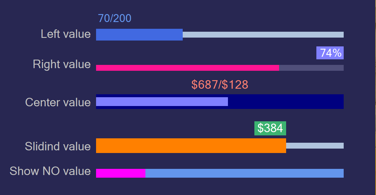
The BitnovaProgressBar is a custom Windows Forms control within the Bitnova.UI.WinForms.Controls namespace that extends the standard ProgressBar control. It provides a visually enhanced progress bar with customizable channel and slider colors, heights, and text display options, including support for symbols and maximum value display.
Overview
The BitnovaProgressBar control inherits from the System.Windows.Forms.ProgressBar class and offers a modernized appearance with customizable styling. It supports a channel (background) and slider (progress) with adjustable heights, configurable text positioning, and optional symbols before and after the value. The control uses custom painting to achieve a sleek design.
Key Features
Customizable Appearance: Configure channel and slider colors, heights, and text styles. Text Display Options: Show the progress value with customizable positioning (Left, Right, Center, Sliding, or None) and optional maximum value display. Symbol Support: Add custom symbols before and after the displayed value. Smooth Rendering: Uses custom painting with UserPaint for precise control over visuals. Designer Support: Properties are accessible in the Windows Forms Designer under the "Bitnova Code Advance" category. Optimized Painting: Reduces unnecessary repaints when the progress reaches the maximum or minimum value.